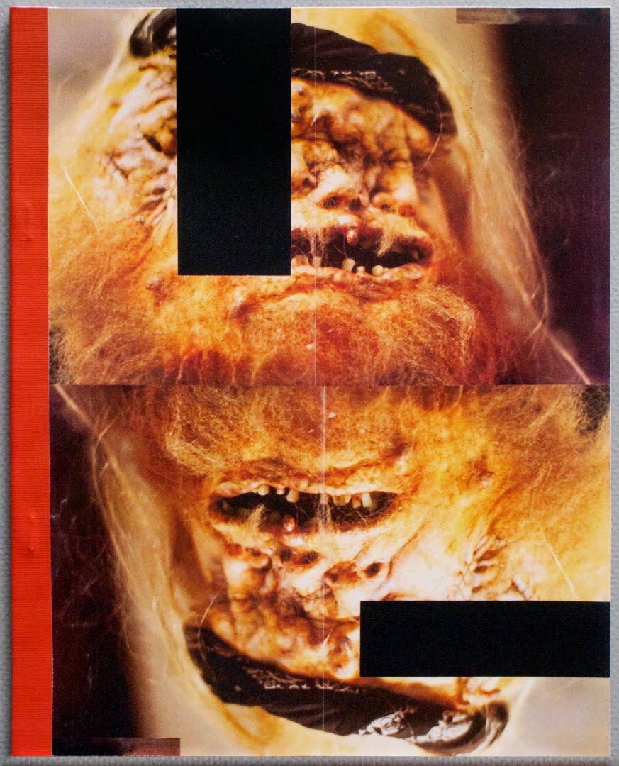
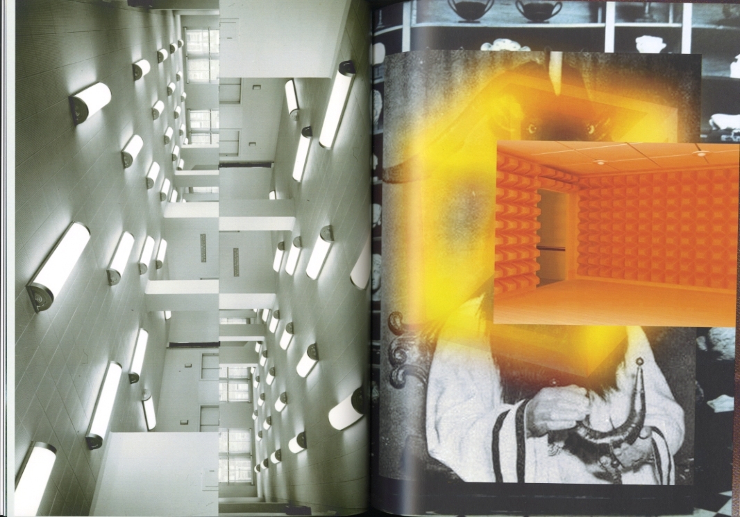
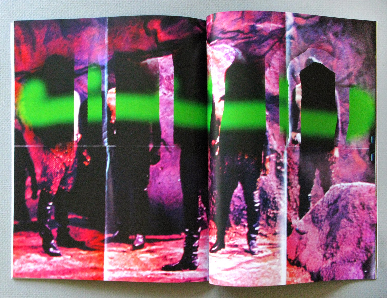
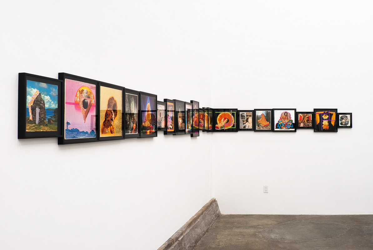
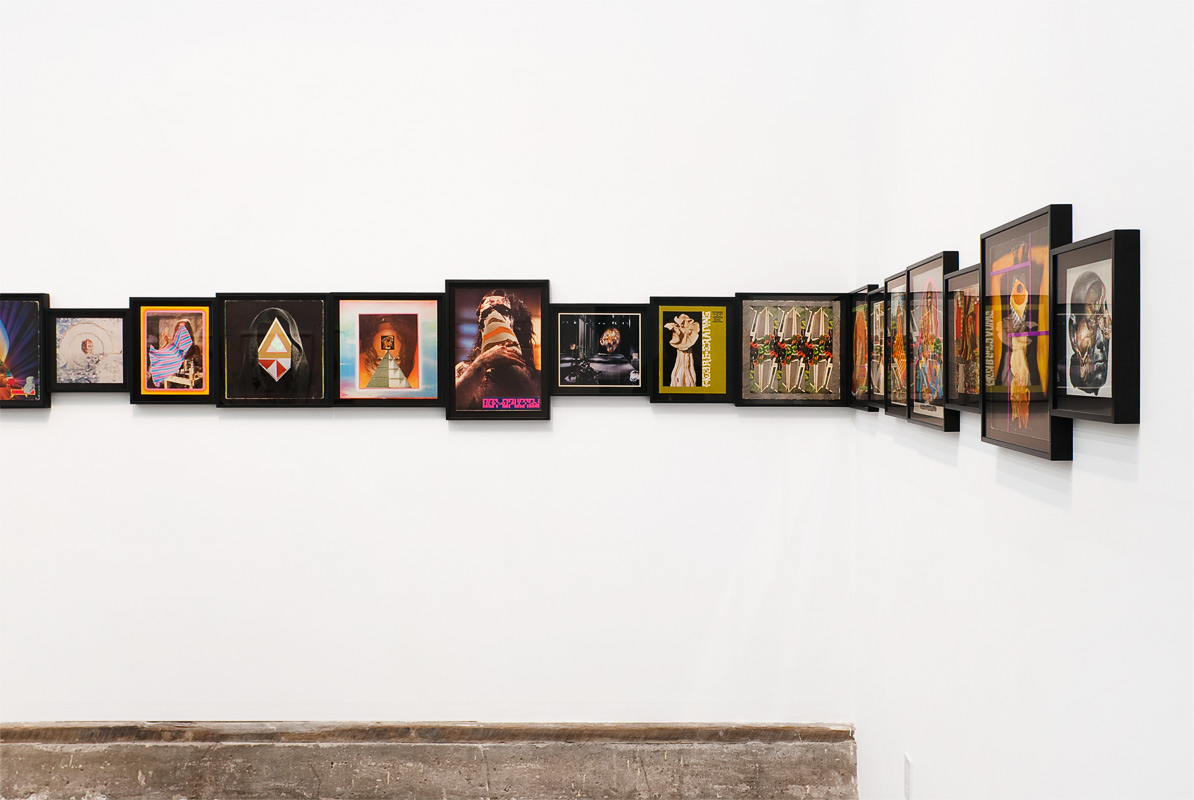
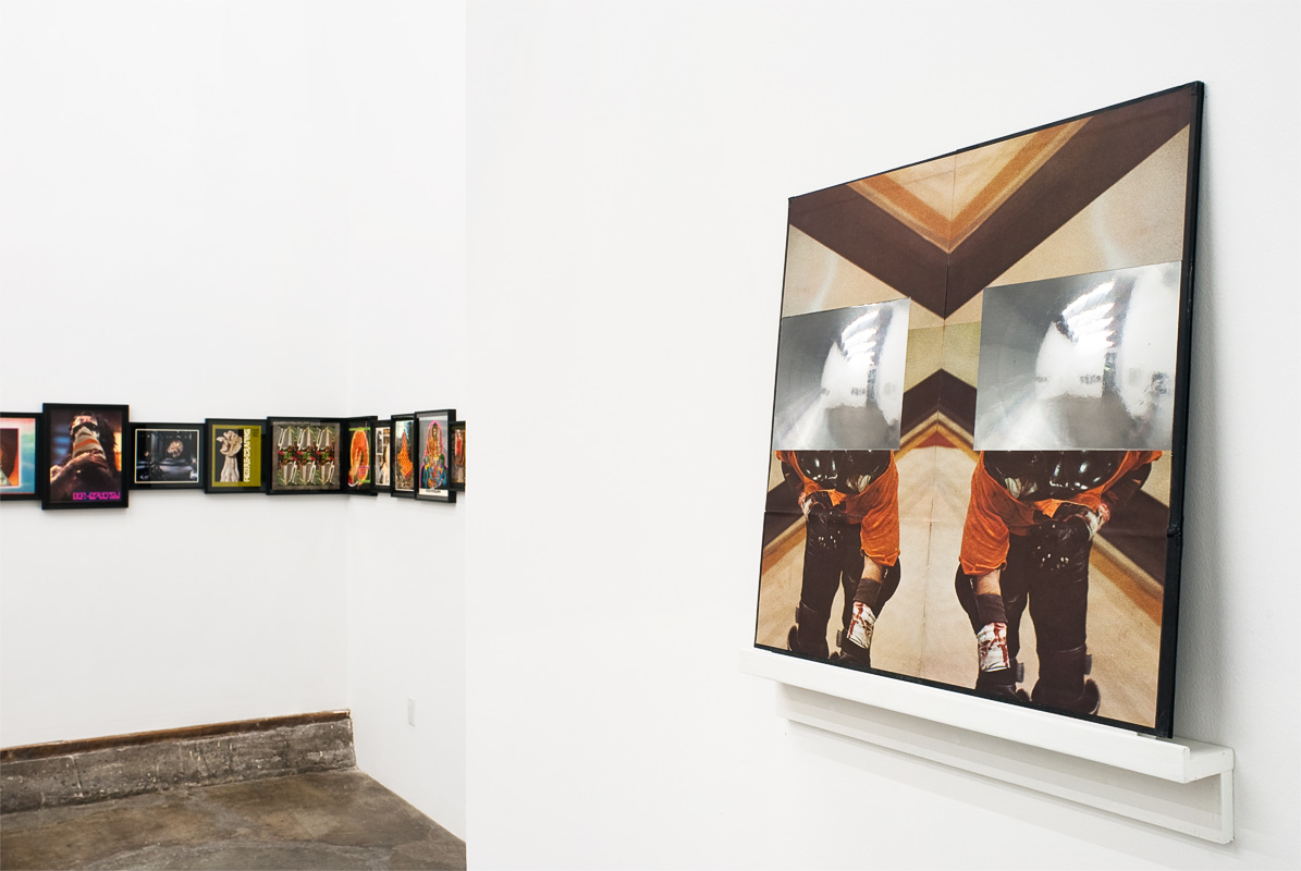
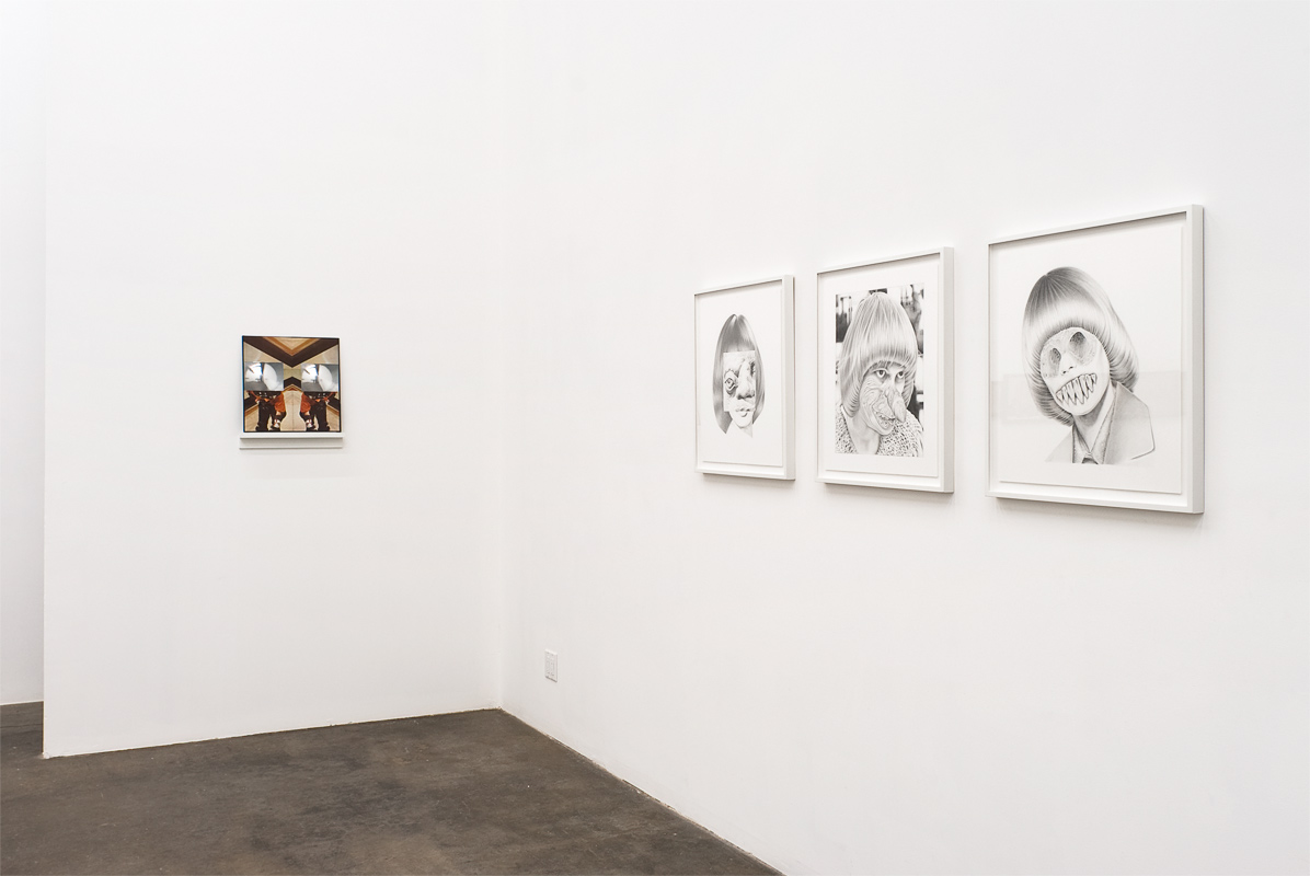
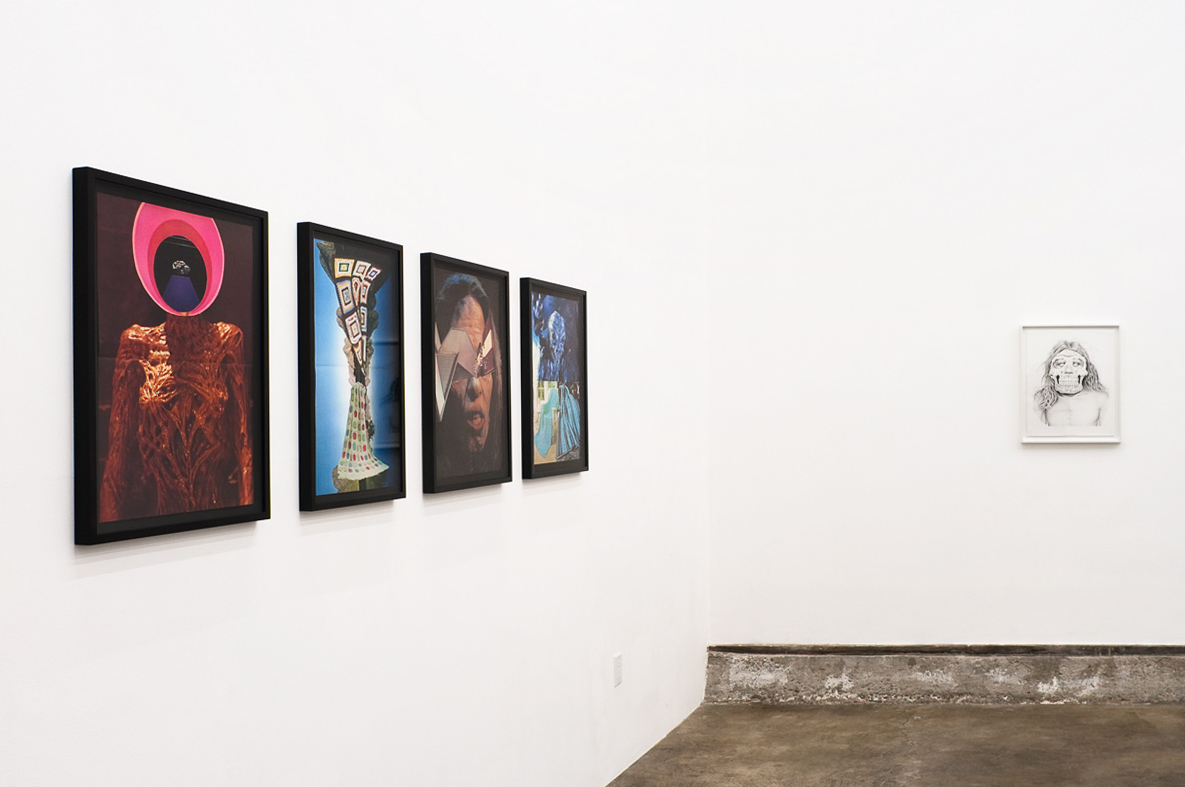
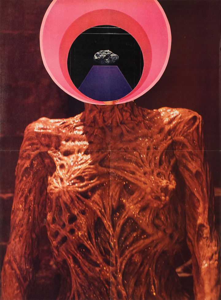
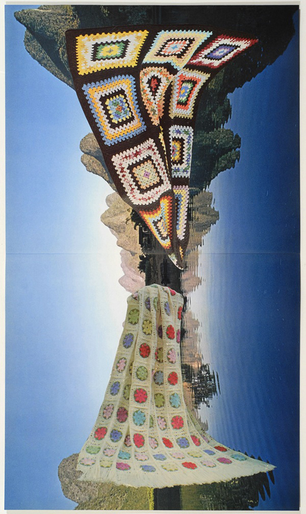
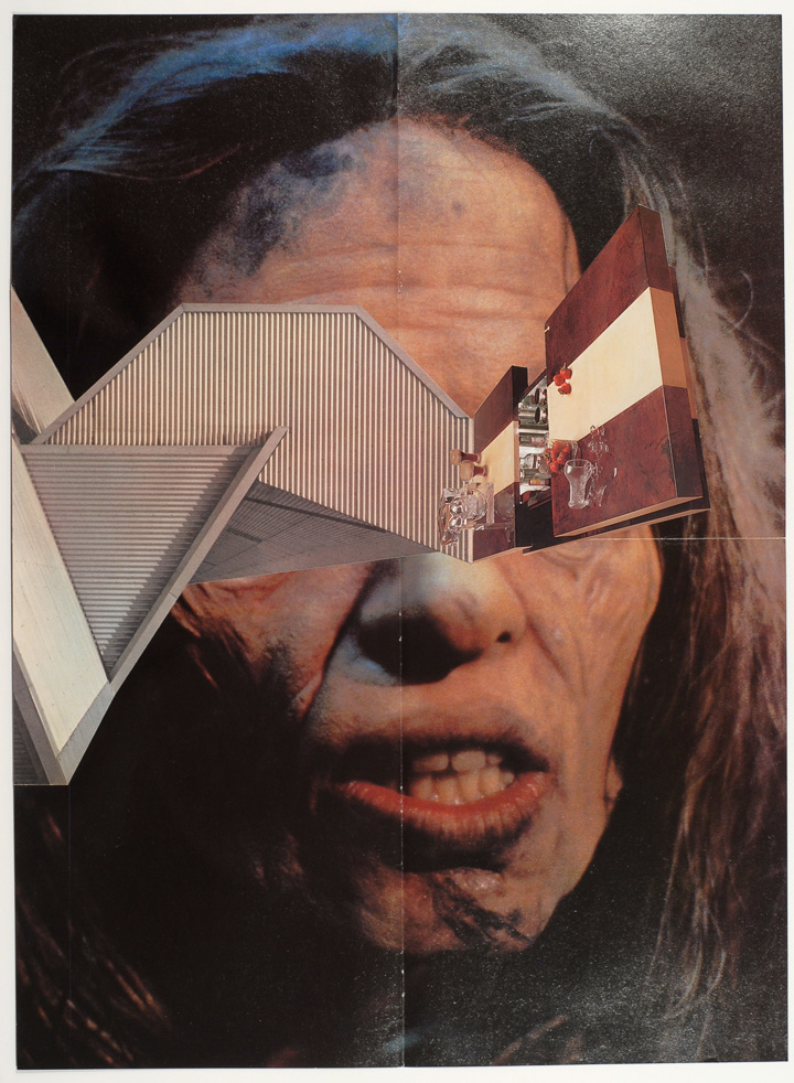
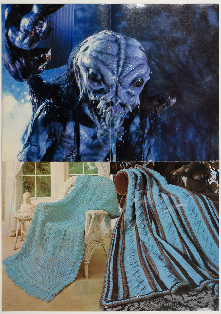
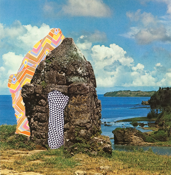
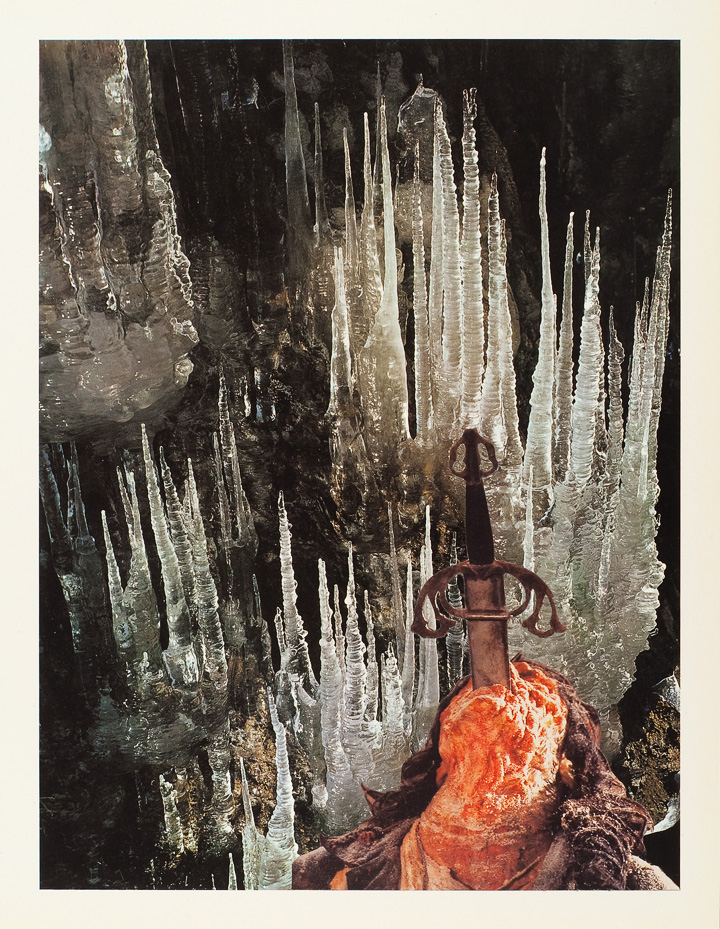
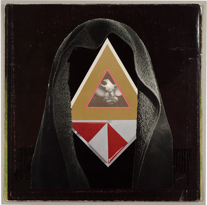
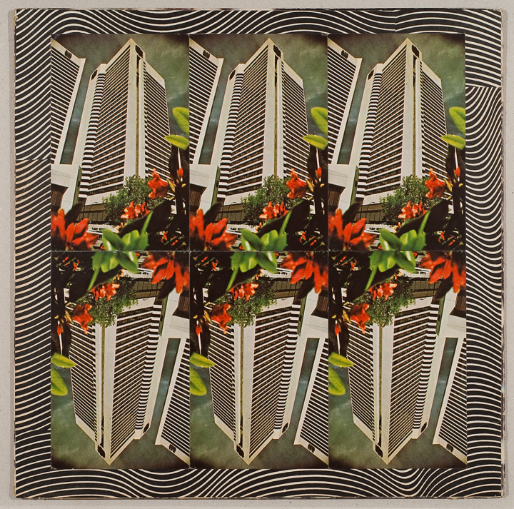
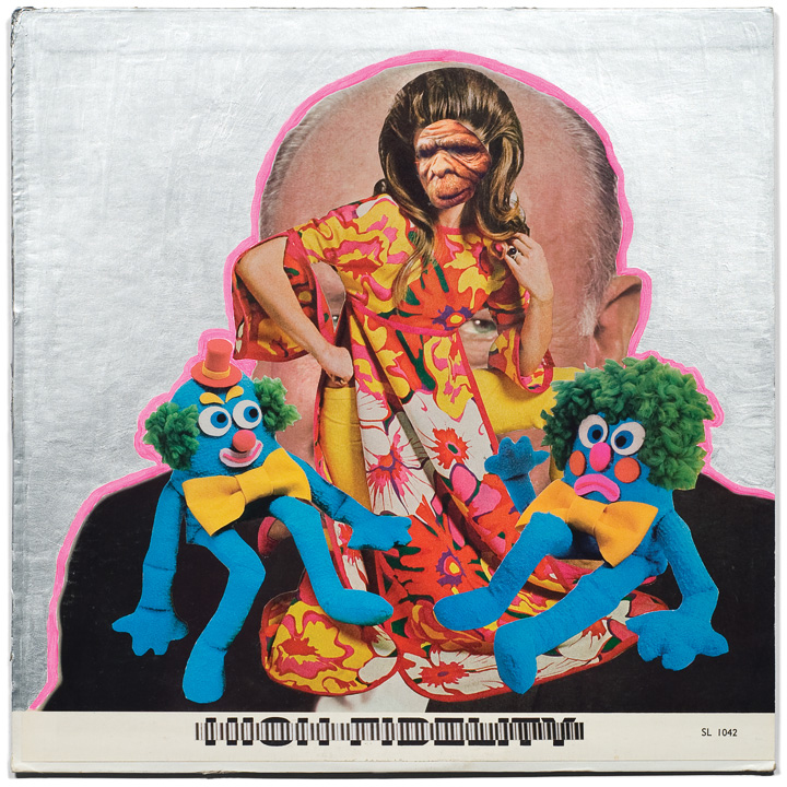
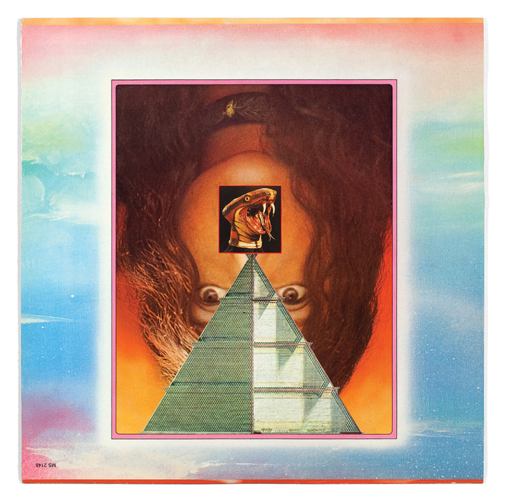
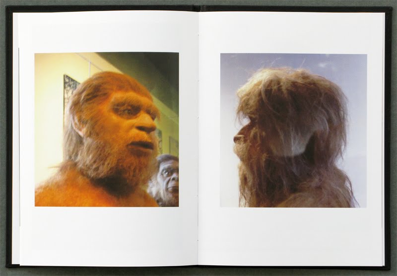
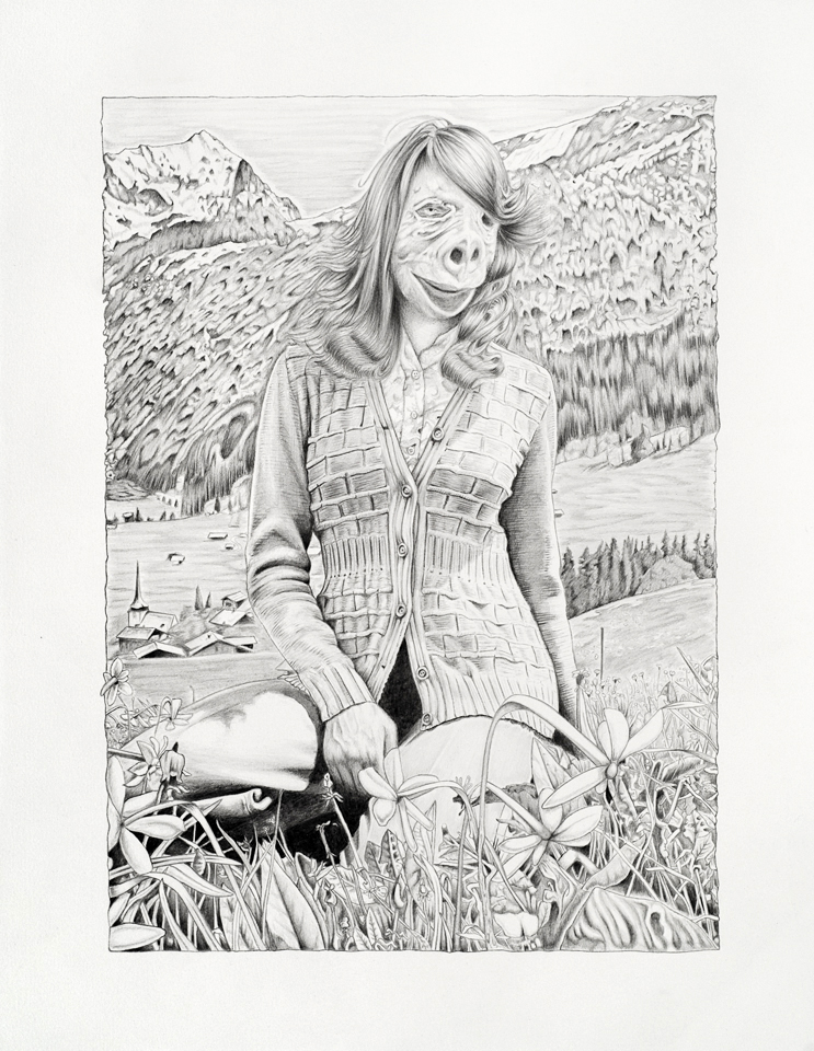
The Luxury of Rigor, 2013.
Softcover, 54 pages, full color, 10.5 X 8.25″, open edition.
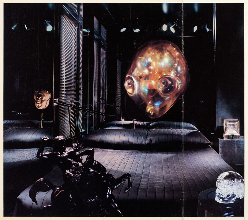
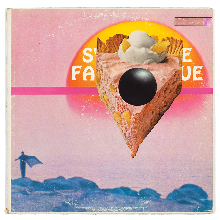
The Luxury of Rigor, 2013.
Softcover, 54 pages, full color, 10.5 X 8.25″, open edition.
http://blog.sfmoma.org/2012/02/collection-rotation34/
SFMOMA Open Space, February 13, 2012
The following collection reflects my interest in perception, specifically color, juxtaposition, scale,
composition, and the ability of context to alter the meaning of images. When organizing this work I
tried to choose pieces that I imagine had originally challenged visual conventions through their use of
imagery, process, appropriation, and color. While some images are reproduced singly, others are
reproduced in contrasting pairs and combinations that may suggest an alternative, or “third,”
meaning.
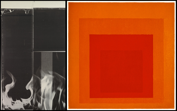
Josef Albers, Homage to the Square: Confident (1954) Albers developed a pragmatic minimalist
process in which oil paint applied straight from the tube onto Masonite was somehow transformed
into magical paintings that seem literally to emit light. Through his teaching, and his book The
Interaction of Color, Albers urges the viewer to see color with new eyes. His simple but painstaking
contrast-and-compare experiments cannot be done digitally, but require real-world materials like paint
and paper. We see what is in front of us — not color as seen from a back-lit computer monitor, but
the actual color and its interactions with light, the time of day, the environment, etc. Albers epitomizes
the idea of physically experiencing the work, of having a bodily reaction to it. When viewing these
paintings we are not passive — we are participants.

But in contrast to this physicality, I also wanted to think about how images are viewed on the screen.
More specifically, I thought a lot about the blog or web format; how we scroll down (rather than
scanning left to right), how the imagery and text on the sidebar affects our visual perception of the
images that we see, how the desktop frames the images, and, further, how we block out the world
around the screen. The blog can be a cluttered space, far removed from the idealized white cube of
the physical realm, but it also allows for differences in representation that can present opportunities
for intentional slippages and alterations of meaning.
For example, we tend to view images more democratically online. 72 dpi web resolution is standard,
the color palette has been minimized for the web, and scale has been rendered nearly irrelevant. It
is difficult to determine scale on a laptop, so everything can become vaguely similar. When a
mural-size painting reduced to an 8” x 6” jpeg is placed next to a 4” x 6” jpeg reproduction of a
playing card, scale can become deceptive. With the blog post, scaling images up or down creates an
overarching equality even more restrictive than physical photographic reproduction due to the
limitations of both the blog template and the screen size.
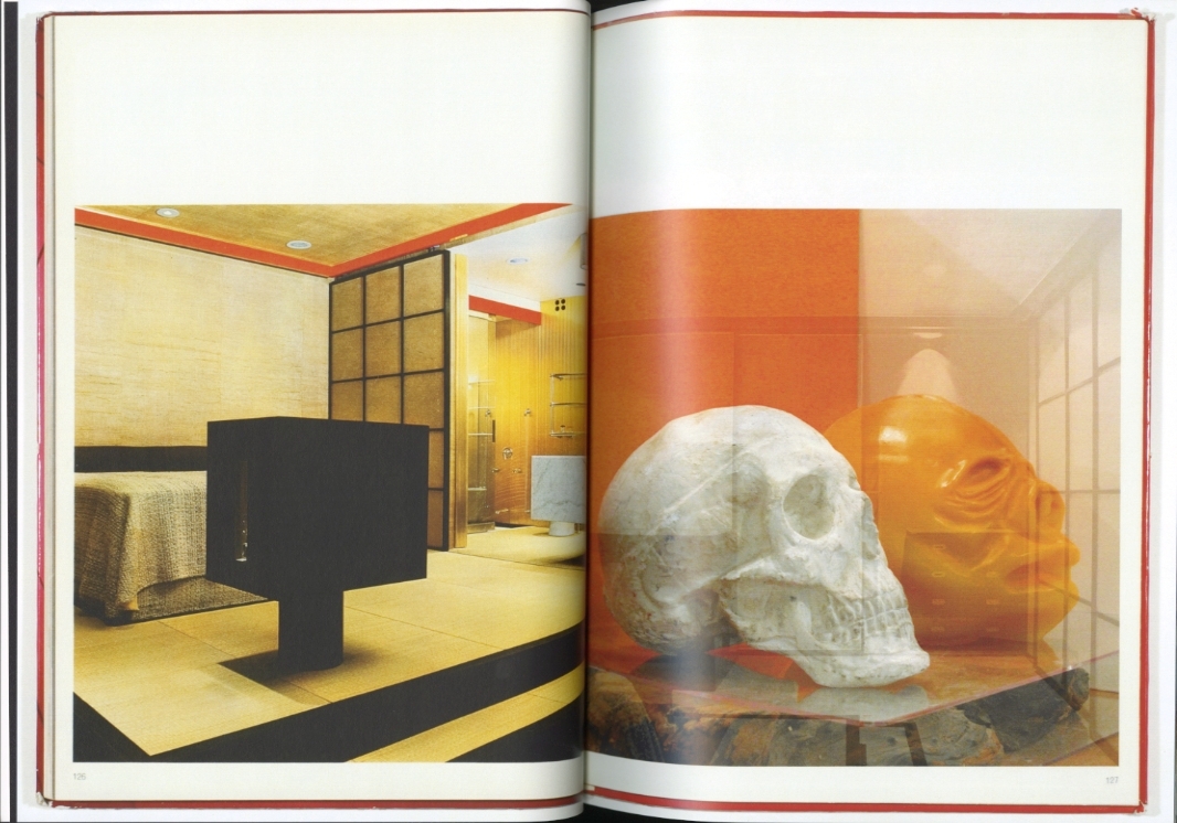
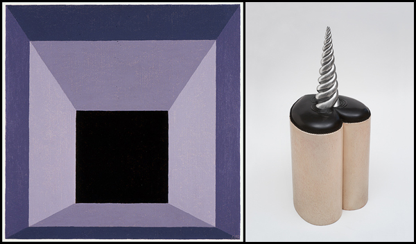
With this in mind I paired a 2-D painting and a 3-D object, Josef Albers’s Homage to the Square
(1962) alongside the Peter Zecher sculpture Thing 5, Black Heart (1968). Zecher was a sculptor
based in Los Angeles whose work focused on process, materials, and geometry. While disparate,
Albers’s and Zecher’s work can relate to each other via multiple levels of mediation (i.e., the
initial documentary photographs of the works themselves, subsequent digital reproductions of those
photographs, and formatting for the web again via scale, reduced color options, altered context, etc.).
Zecher and Albers are then shown here at equal heights, though Zecher’s sculpture is nearly 4 feet
tall and Albers’ painting is a 2-by-2-foot square. The space in between these images is minimized,
while the black borders frame them to suggest a formal continuity and possible connections in content.
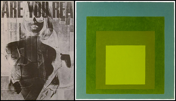
These same framing devices are used to pair an untitled piece from Robert F. Heinecken’s series
Are You Rea (1968) with another Albers Homage to the Square (1969). Heineken, who is having a
resurgence at the moment, was a photographer devoted to working with preexisting photographs. Much
of his work focused on rephotographing magazines, which he often placed over a light table and shot
to expose both sides at once. His work complicates everyday images of commercial advertising,
photojournalism, and pornography through juxtaposition, revealing unexpected connections as we view
both sides simultaneously. Often linked with 1980s appropriationist artists, Heinecken seems
dedicated to undermining the modernist conventions that artists such as Albers pioneered.
The pre-digital, appropriated, rephotographed, and often degraded image is also ubiquitous to the art
of punk flyers and fanzines of the late seventies and early eighties. The radical degradation and
mutilation of mainstream imagery in early punk graphic design has been so influential on
contemporary visual culture that it’s easy to forget that we haven’t always been looking at things
this way. Heinecken’s work shares an aesthetic connection to this genre — especially with the imagery
of V. Vale’s San Francisco–based Search & Destroy magazine. Since SFMOMA has no copies of
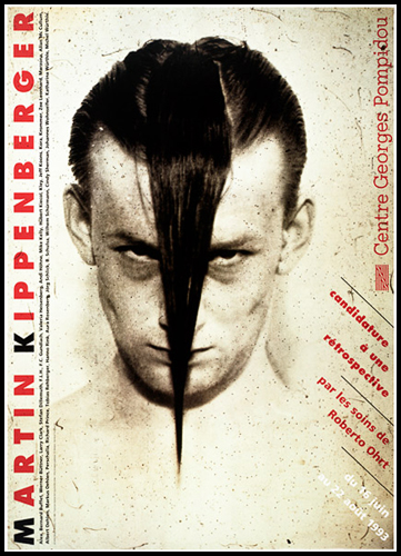
Search and Destroy, nor any punk flyers from this period, I have included Martin Kippenberger’s
poster Candidacy for a Retrospective (1993) with the artist pictured sporting an iconic Misfits
devilock.
These flyers and fanzines are also nothing without collage, a DIY medium with the inherent ability to
make the familiar strange through juxtaposition. For example, in Georges Hugnet’s Initiation
préliminaire aux arcanes de la forêt (First Initiation to the Secrets of the Forest) (1936) the same
figures are merely repeated in multiple positions within a single composition. This work employs the
surrealist cut-and-paste approach to photographs and printed matter that we later see utilized by Jess,
Search & Destroy, Jamie Reid, and the underground graphics of countless anonymous others.
Hugnet’s image evokes Feuillades’s Vampyror Fantomas — a campy Satanic ritual that can be seen
as an early predecessor to the pseudo-evil of Kippenberger’s Misfits tribute. Here Hugnet and Albers’s
Homage to the Square: In May (1960) connect through the democratized yellow web color, but the
dualism between the forbidden unconscious and Albers’s logic remains.

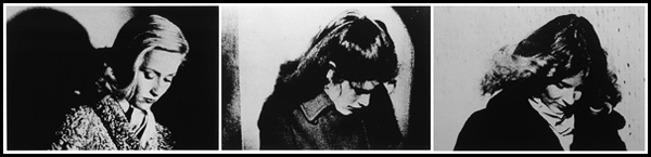
There are also the more straightforward combinations of existing photos in which the mere proximity of
a specific image next to another image can alter the intended meaning of both. Richard Prince’s
Untitled, Three Women with Heads Cast Down (1980) simply uses similar fashion photos to reveal
the ubiquity of certain poses. Identifying these connections is a result of visually scanning image after
image and making connections between them. Prince’s early years working in the tear-sheet
department at Time magazine definitely sharpened his skills in this regard.
In keeping with these ideas of juxtaposition, proximity, and scale I organized a few new examples
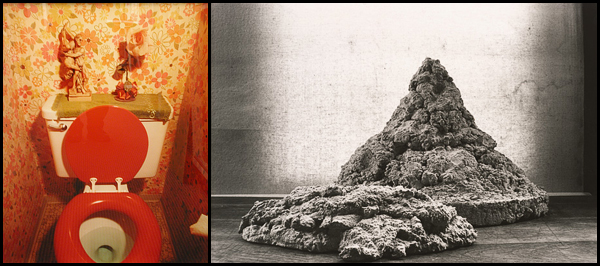
utilizing existing photographs taken from the SFMOMA image database. Below is a combination of Bill
Owens’s Tidy Bowl, Walnut Creek (1979) with David Ireland’s Concrete Study(1993).
One thing almost never available to the traditional cut-and-paste collage artist using found print
materials is symmetry. While pretty straightforward in Photoshop, symmetry is impossible with found
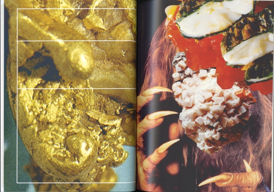
photographs unless you re-photograph them and flip them in the darkroom. But the database did reveal
two photographs by Mark Ruwedel, Tonopah and Tidewater #1 (1995) and Southern Pacific #9
(2005), which, though not truly symmetrical, strongly suggest it. These I combined with Martin Parr’s
Untitled [sausage tubes], from the series British Food (1995).
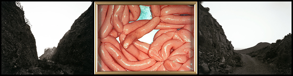
These last images also point directly to the contrast between color and black-and-white that runs
throughout this collection. While Albers turns up the volume on physical experience, the color of Parr’s
sausages or Owens’s bathroom connects us to the full-color world we inhabit. By contrast, many of the
black-and-white or low-key images here utilize or appropriate printed material: black-and-white
photography, or now vintage halftone mass-produced media. These works exploit the abstraction of
black-and-white imagery, which by nature declares itself as a mediated representation.
Below, Albers’s Study for Homage to the Square (1972) sits alongside Untitled (2008) by Wade
Guyton, an artist who often digitally prints over existing images from magazines, books, catalogues,
etc. Guyton coaxes these nonconforming, alien materials into Epson printers to produce paintings that
revel in their drips, stutters, spatters, and overall degradation. This work bypasses photography and
goes straight to the printer, asking us again to reconsider the possibilities of painting through mechanical
means. Here this imperfect, machine-generated work is paired with a last pristine, handmade Albers
square.
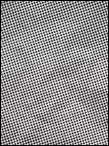
As a final example of the shift in vision and seeing that’s taking place through the rise of the digital, the
blog, and screen-based viewing, I chose Tauba Auerbach’s Crumple II (2008), a painting of a
halftone reproduction of a crumpled piece of paper blown up to 80″ x 60″. Like Guyton’s piece, Crumple
II takes some inspiration from the ancient artifacts of print-based media. Reduced here to a small jpeg,
the work looks like a slightly skewed, innocuous, grey rectangle. But in person Crumple II has the
powerful physical effect of total disorientation. While viewing it I was literally unable to focus properly.
Without touching the surface, but only looking at the piece with my eyes, something happened to my
body. If you get a chance, step away from the screen and see this painting — it’s hanging in the
museum right now.
Scanners is a month-long used bookstore project that highlights the book as a physical object in an increasingly dematerialized world.
Our work with used books originated—and continues—in the salvage culture of the flea market, where we have supplied readers and artists with literature, non-fiction, and visual source material for over a decade. Scanners grows from this experience and takes the transient nature of the flea market site indoors for a short-term experiment in duration. With idiosyncratic materials and categories, and an emphasis on face out display, Scanners is also a proposal: one possibility for what a future bookstore might be.
Scanners will focus in part on visual culture, including art, architecture, and craft, as well as print-based media for use as source material. Other sections—on theory, counterculture, and technologies of the word, among others—will sit alongside vintage punk rock fanzines, VHS tapes and obscure ephemera.
Events at the store will examine topics in contemporary print culture, including: the printed image as source and inspiration; the changing nature of the reading experience; the future of the archive; the role of the internet in the search for knowledge and as an arbiter of value; and, despite the rise of the digital, the continued explosion of printed matter.
Developed and operated by Matt Borruso and Nick Hoff, Scanners will be open for the month of October, 2011, in San Francisco.
Huffington Post
Art Practical
KQED Arts
Mission Local
Resonant City

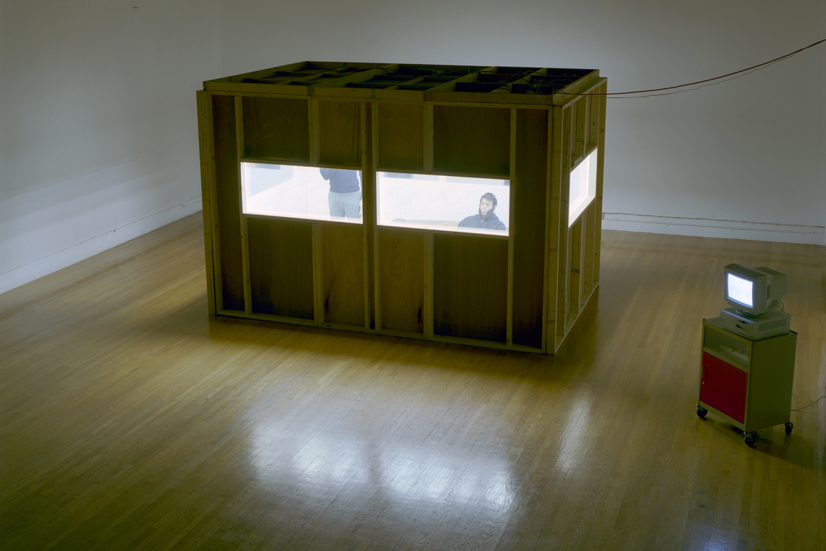
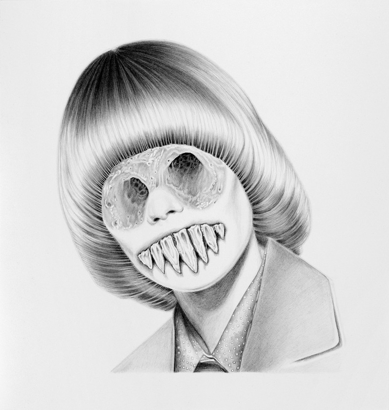
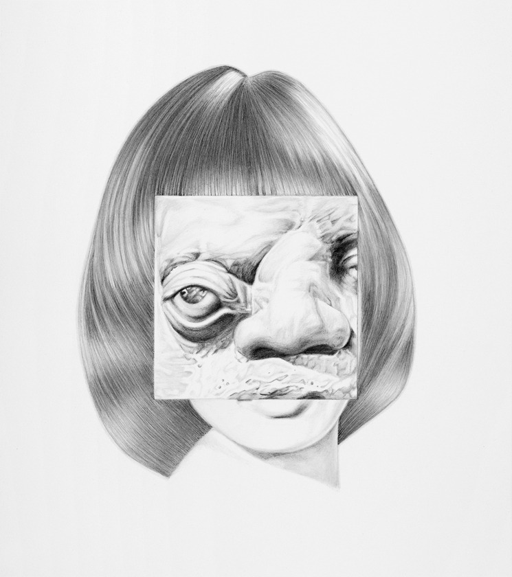
The Hermit’s Revenge Fantasy, September 10 – October 8, 2011. Steven Wolf Fine Arts, San Francisco
press release
Artforum
Art Practical


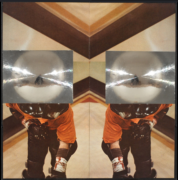

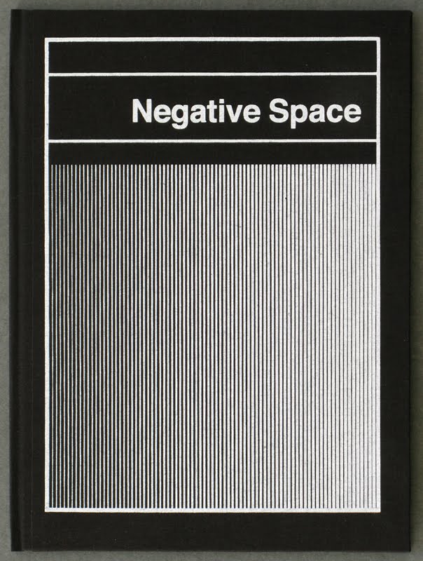
Negative Space, 2010 and 2017.
Softcover, 44 pages, full color, 10.25 X 7.5″, one color hand screened covers, hand sewn binding, edition of 100. Second printing, 2017.
Hardcover, 44 pages, full color, 10.25″ X 7.5″, one color hand screened covers, hand sewn binding, edition of 50, 2010.
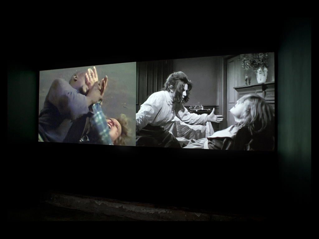
Return To Holy Mountain, April 11 – May 17, 2009. 2nd Floor Projects, San Francisco, CA.


1984-2001: SCIENCE FICTION
SUNDAY NOV 8, 3:00 PM
SMACK MELLON
92 PLYMOUTH ST,
BROOKLYN, NY 11201
Ad Hoc Vox and Smack Mellon are pleased to invite you to 1984-2001, a panel discussion about science fiction developed in response to the utopic and dystopic elements in Smack Mellon’s current exhibitions. This panel will take place at the gallery on Sunday, November 8th at 3:00 p.m.
George Orwell’s 1984 was written during the Second World War and Stanley Kubrick’s 2001 was released in 1968. That these moments of cultural upheaval produced two such extreme visions of the future is hardly a surprise; sometimes referred to as speculative fiction, science fiction is premised on a radical re-imagining of the cultural moment. Whether optimistic or cautionary, any representation of a set of social conditions that differs from the author’s own are bound to that author’s aspirations for the present, making science fiction a genre often read for its political import.
With futures proposed by 1984, 2001, and so many other works of science fiction now set in our past, it is also a genre that has developed into a highly codified language with easily recognized aesthetic forms. Thus, science fiction has a history subject to both scholarly scrutiny and artistic employment, and both forms of engagement can explore science fiction’s relationship to its contemporary environment, speculative possibilities, and the tropes of the genre.
Ad Hoc Vox has gathered together practitioners, critics, and scholars who have studied science fiction’s role in literature, film, and architecture to discuss what possibilities science fiction offers contemporary artists. The panel’s participants are Ed Halter, Carrie Hintz, Geoff Manaugh, and Deborah Taylor. Matt Borruso will moderate the panel, which will be followed by a Q&A with the audience.