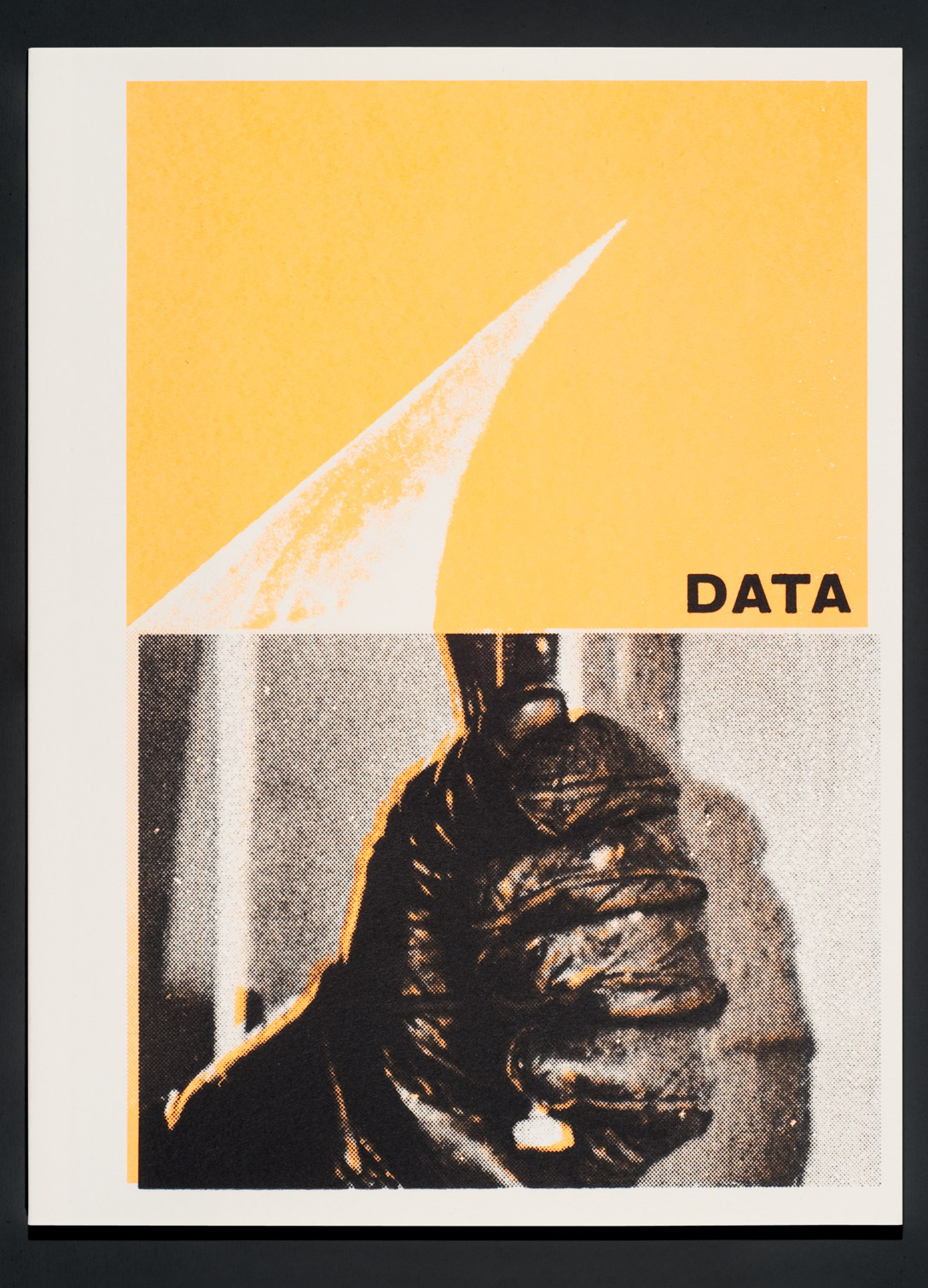
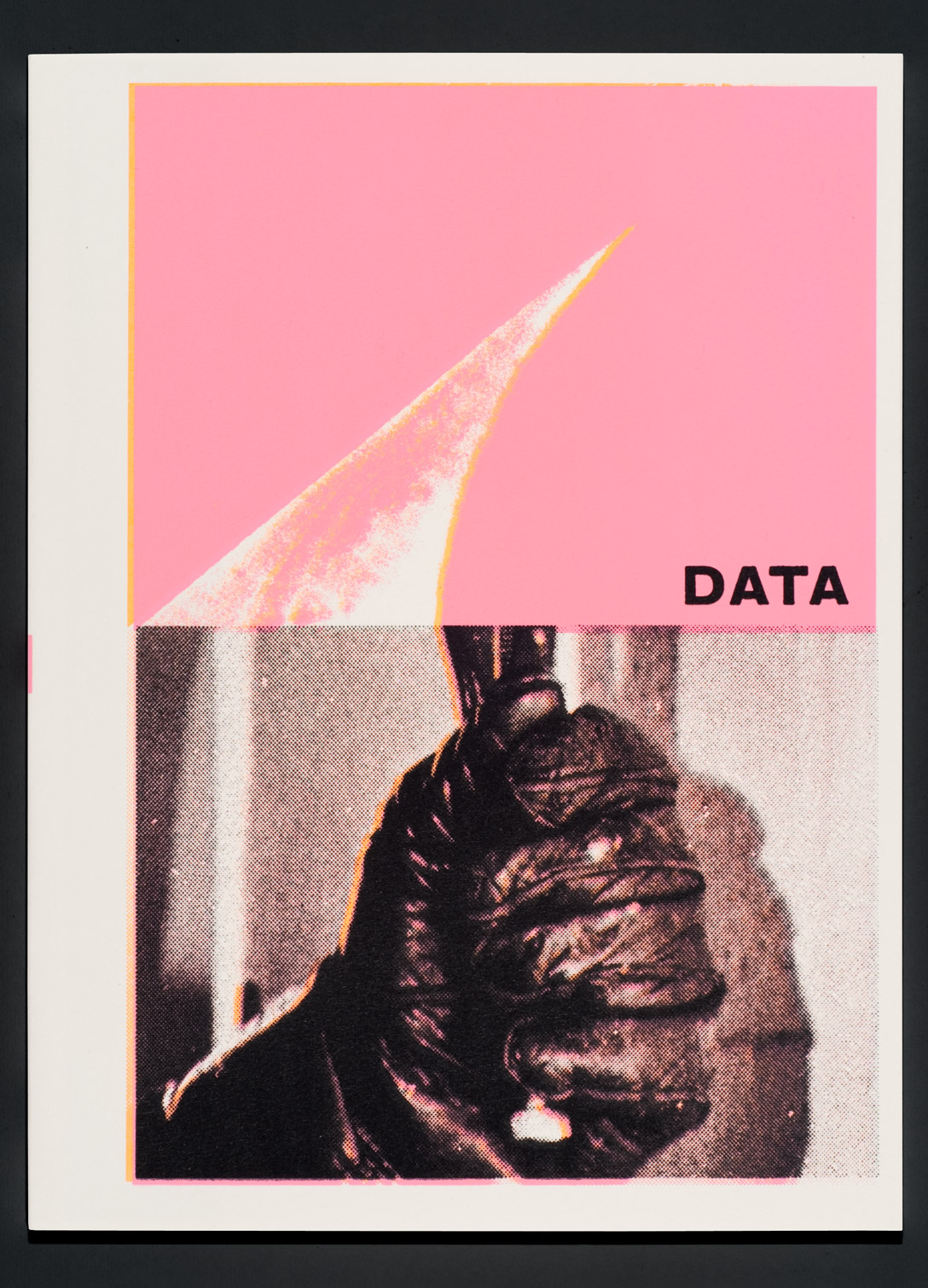
From the book David King Stencils: Past, Present, and Crass!
published by Gingko Press, 2019
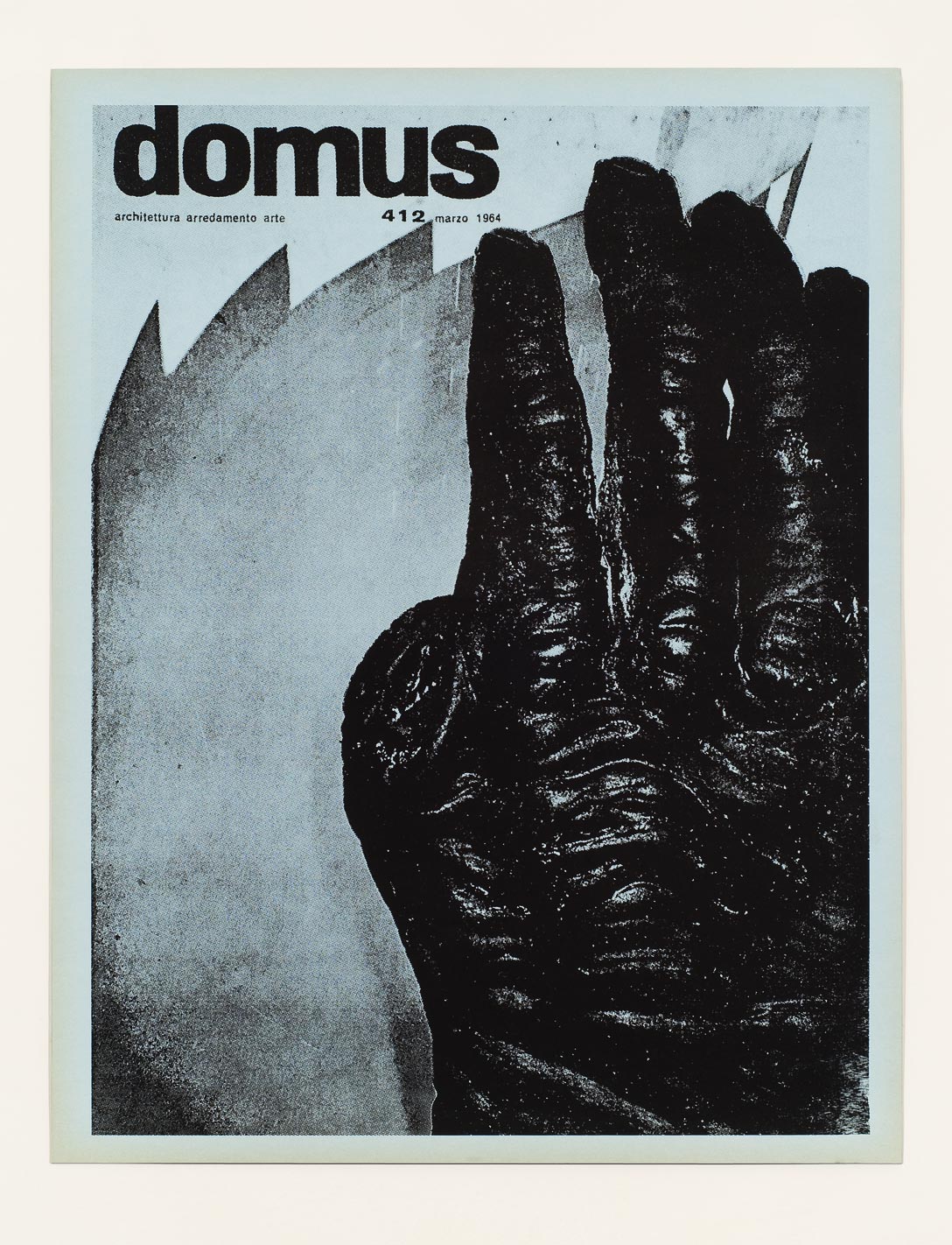
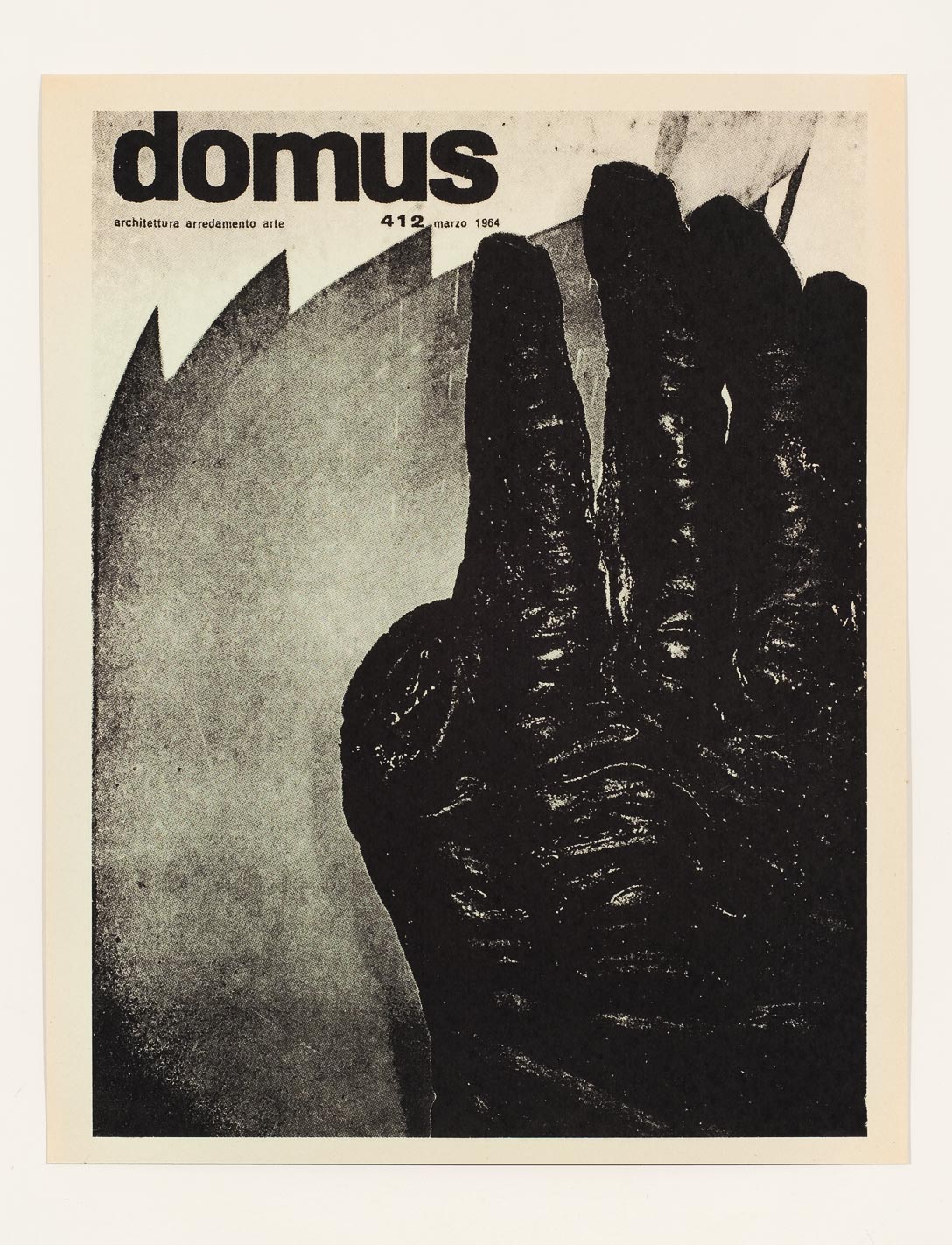
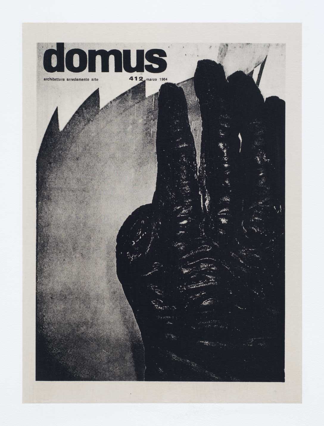
Essential Forms
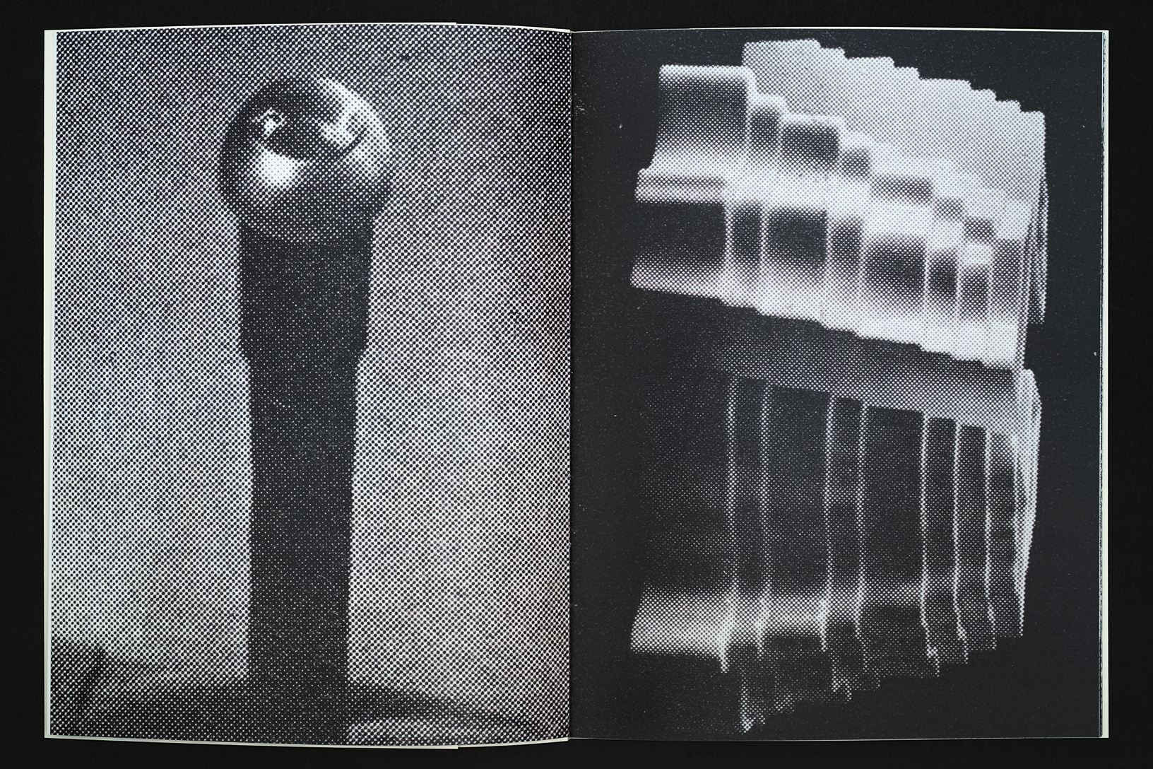
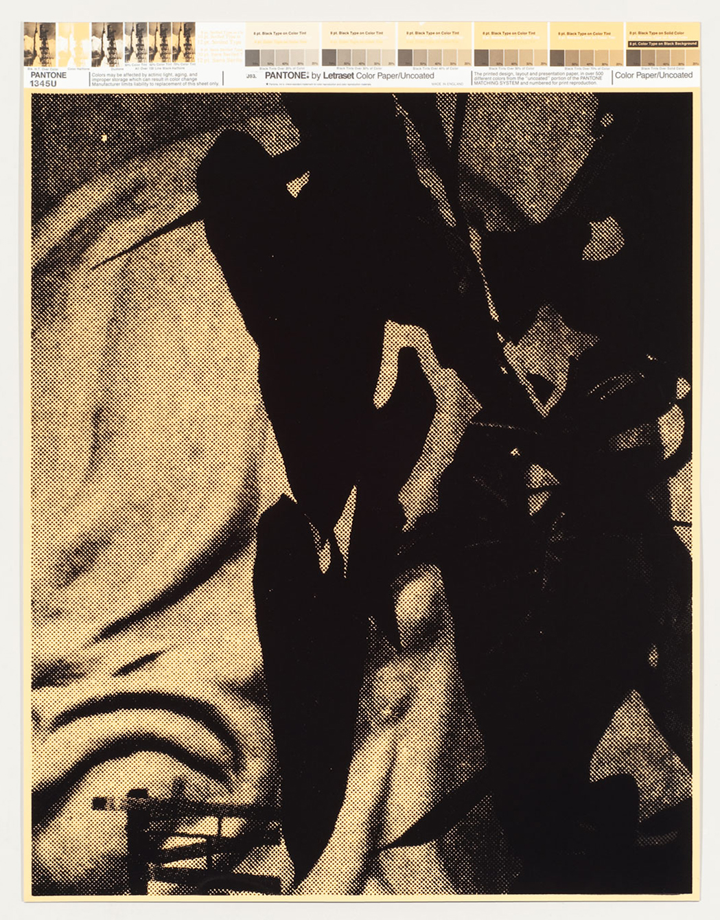
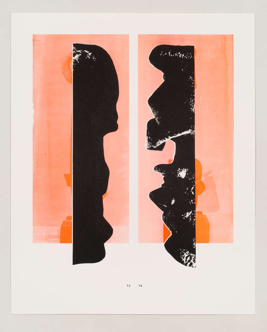
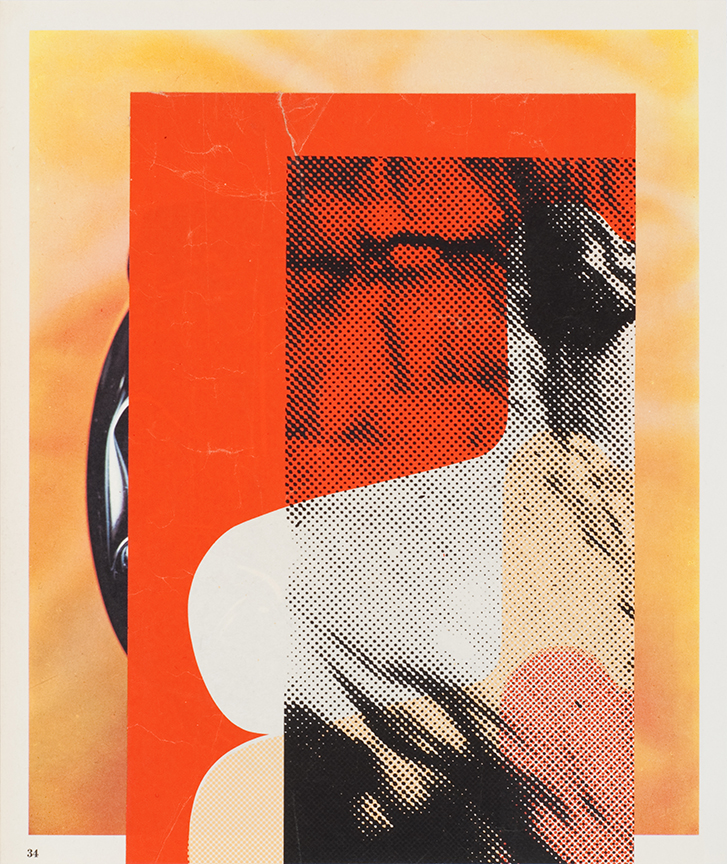
There is a consistent aesthetic found in everything that Dave King does. It can be seen here in
this book, running through every page. His work distills the world into a series of essential
forms: silhouettes, monochromatic objects, frame grabs from films, photographs of shadows,
repurposed logos. Inspiration taken from art, advertising and comic books is boiled down into
only what is necessary. While there is always humor, there is nothing baroque. It is a world
reduced to the least amount of information needed to describe itself.
I met King in San Francisco in the early 1980s when he was part of the band Sleeping Dogs.
Back then I was very interested in his artwork, especially the Sleeping Dogs posters that had
appropriated images of Mickey Mouse and the Batman logo. In San Francisco at that time the
typical punk flyer utilized a rough shredded and torn graphic approach. The Sleeping Dogs
flyers were so different—they felt cartoony, clean and tight. Later I realized that he had designed
the Crass symbol, which was becoming more and more conspicuous in the Bay Area, tattooed
on bodies, and stenciled on walls and studded leather jackets.
In a way the Crass symbol, for which King is best known, is an outlier amongst the rest of his
work. He is typically focused on a singular easily readable form, but the Crass symbol integrates
multiple loaded images—cross, serpent, circle-backslash—into its final design. And its
subversive quality stems from this juxtaposition of well-known images that morph into something
wholly new. It is both enigmatic and familiar.
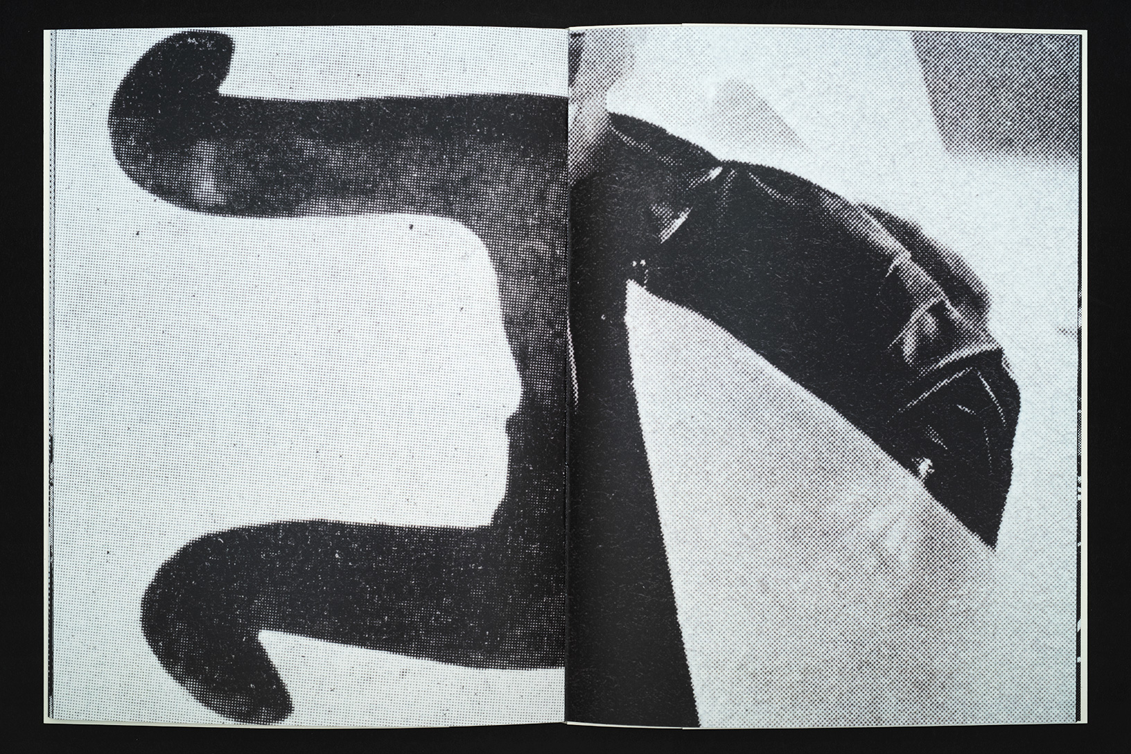
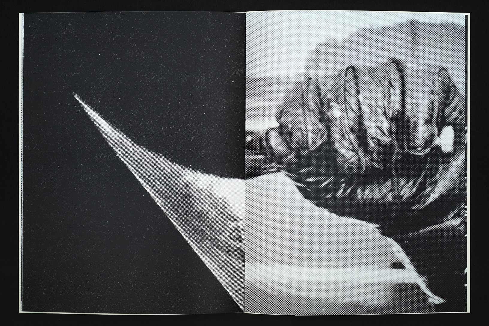
The stencil, in general and as seen here in this book, is a primal and effective tool. The positive
space of the stencil itself is cut away, but then magically reappears as paint is blown through it
onto the intended surface. Think of prehistoric cave paintings of hands, achieved simply by
holding the positive hand on the cave wall, filling a mouth with pigment and spitting onto the
“stencil.” The result is the image of the hand, but also an image of negative space.
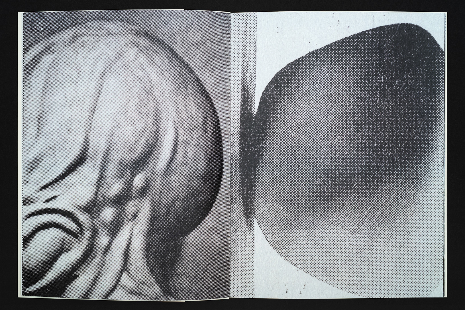
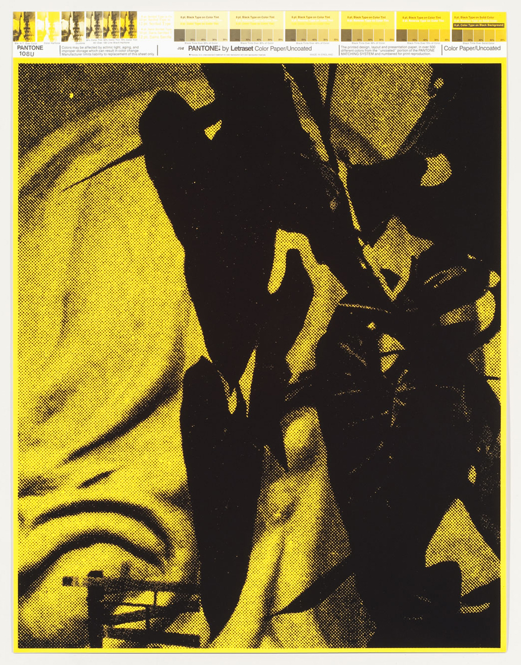
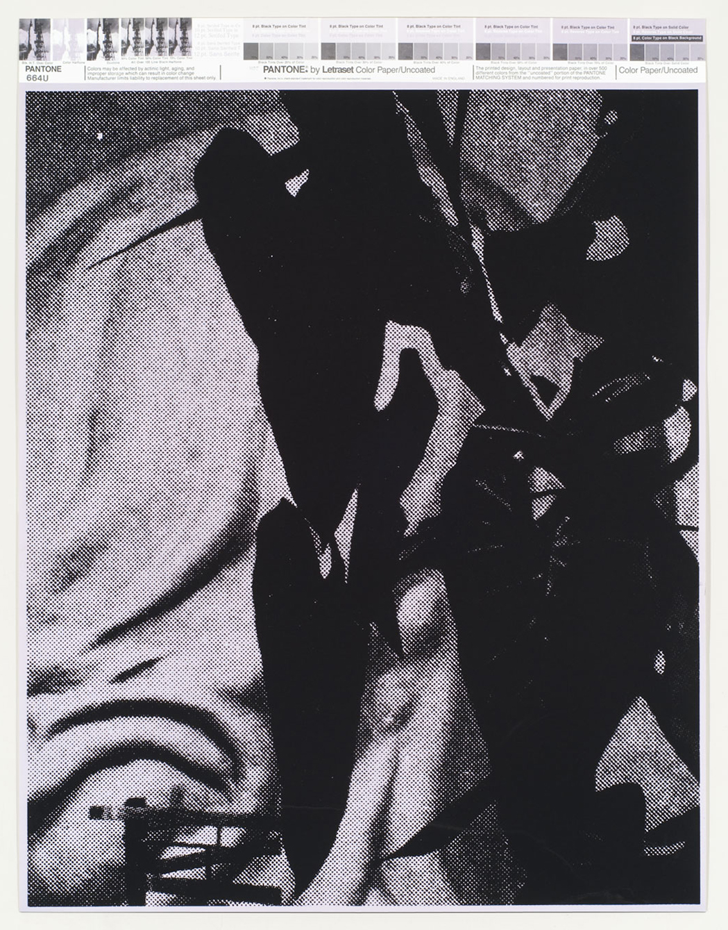
The stenciled pieces presented here are a lot like the work that King has made in other
mediums—high contrast, graphic and readily visible from a distance. He is obsessed with the
shapes and outlines of certain forms, and their contours and volumes repeat themselves again
and again throughout his investigations. In this book we can see both process and result, a
working and reworking of the same forms to create subtle repetitions and variations on a theme.
King attended art school in South East Essex outside London in the 1960s. He later went on to
work in advertising in London, first as an art director and designer and then as an illustrator from
1967 to 1977. His work always reflects this professional graphic design history, and the specter of
advertising is apparent in everything he has done since. In fact, according to King, the design
of the snake’s head found in the Crass symbol reflects a promotional design piece he had done
for a client, Yorkshire Television, for a series of TV plays called The Seven Deadly Sins. In this
piece the snakes grew more twisted with every sin.
Like many British artists of his generation, King has an obsession with a certain type of
American visual culture—much of it relating to the postwar period. There are many examples of
this impulse in others: J. G. Ballard, Eduardo Paolozzi and Richard Hamilton of the Independent
Group, to name a few. At the same time there is something undeniably British about King’s
aesthetic. After living in America for the last 40 years, it’s as if he sees British visual culture the
way that he once viewed American visual culture. Whereas once it was Mickey Mouse, now it’s
the teapot creeping into the Crass symbol…
In the late 1970s King dropped out of the London advertising world and went to live with some
former art school friends in a communal living experiment in the countryside. This project would
take the shape of what we now know as Crass. It is not a stretch to compare King’s journey
from advertising to punk, to that of the fictional character Don Draper from Mad Men—exiting
Madison Avenue for the West Coast and Big Sur’s Esalen Institute. As utopian dreams fade and
new nightmares emerge, symbols and images of earlier promise remain as potent reminders.
The Crass symbol is one of these. It combines powerful elements into a simple form meant to
express something expansive. It is the distillation of a feeling—the promise of freedom, and the
rejection of a system that never cared about you anyway.
Matt Borruso, 2019