Screening George Kuchar

An online screening of George Kuchar videos selected by Matt Borruso

Friday, September 4 at 7pm PDT, Streaming on TWITCH

yaleunion.org/kuchar/

Still image from Faulty Fathoms (dir. George Kuchar, 2006)

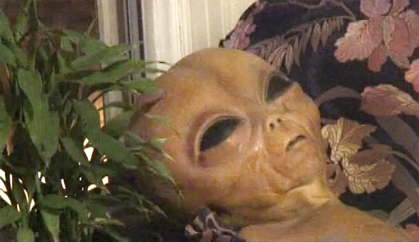
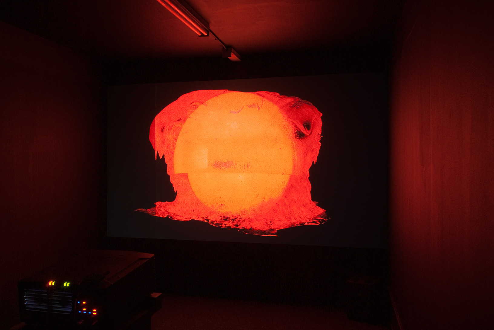
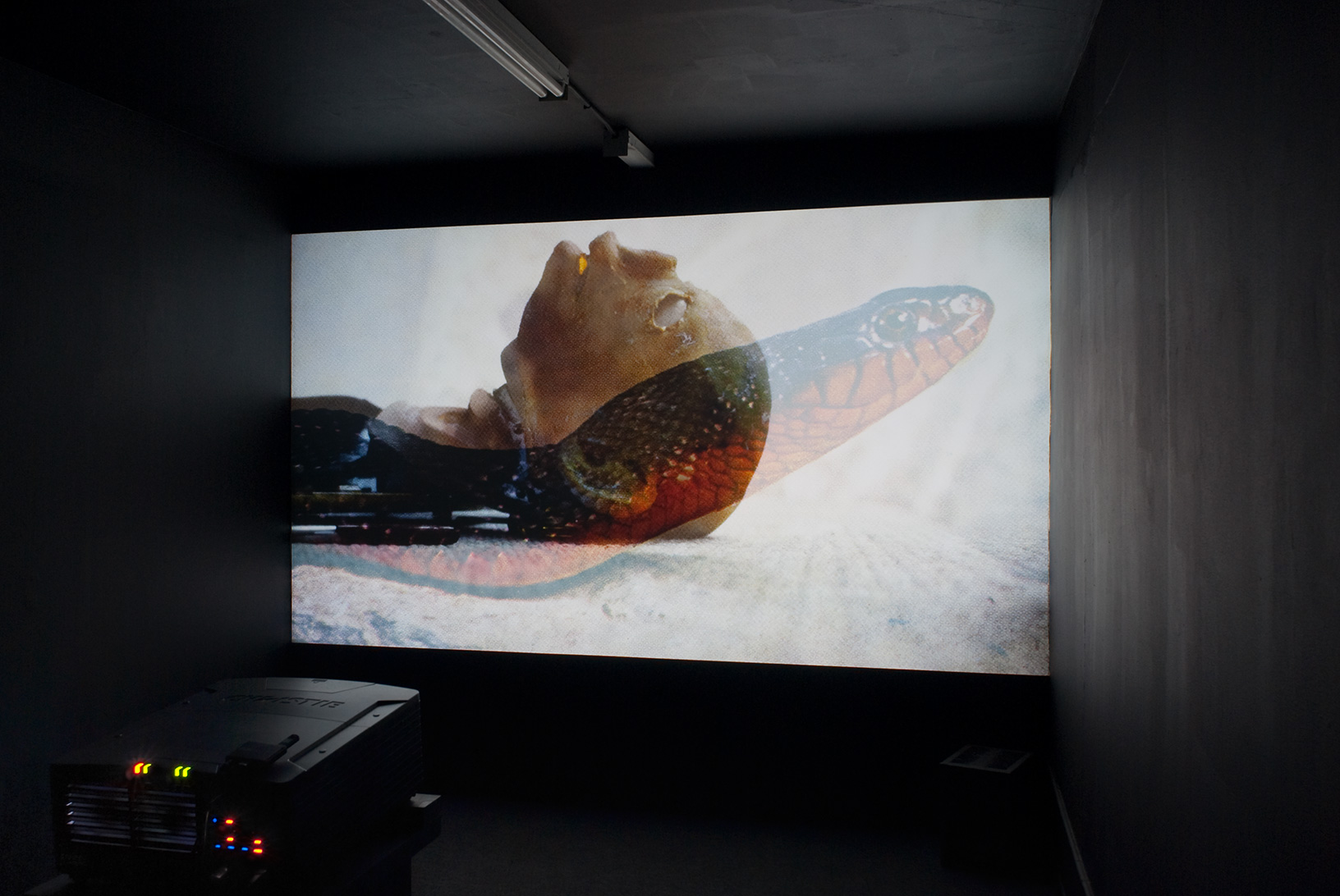
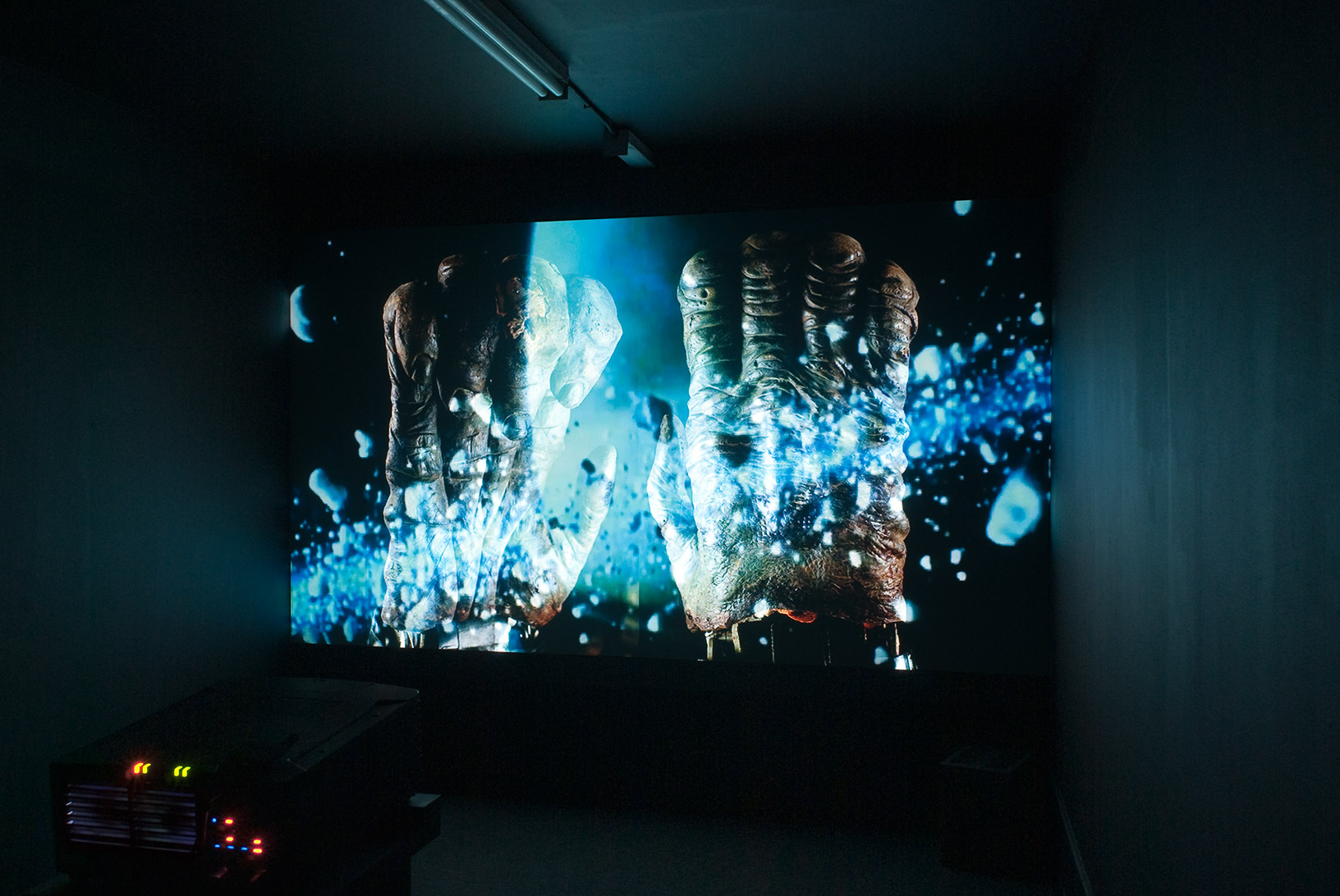
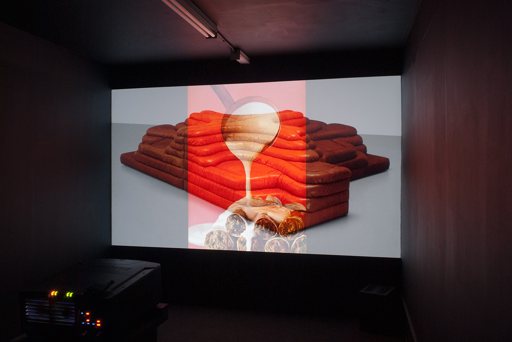
Seaside Show, (20 min, 56 sec), 2008
Faulty Fathoms, (13 min, 46 sec), 2006
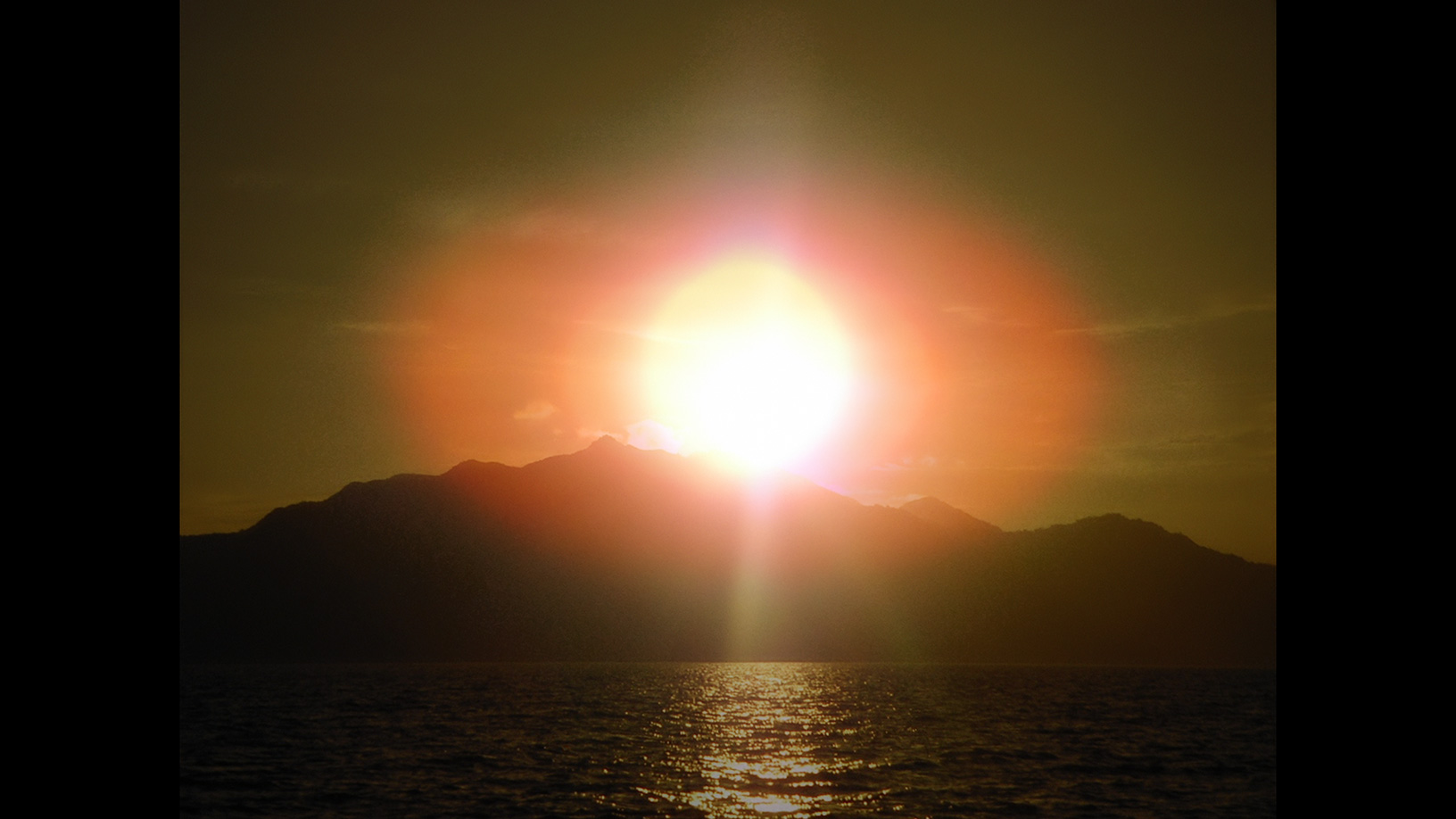
Kingdom By The Sea, (19 min, 02 sec), 2002

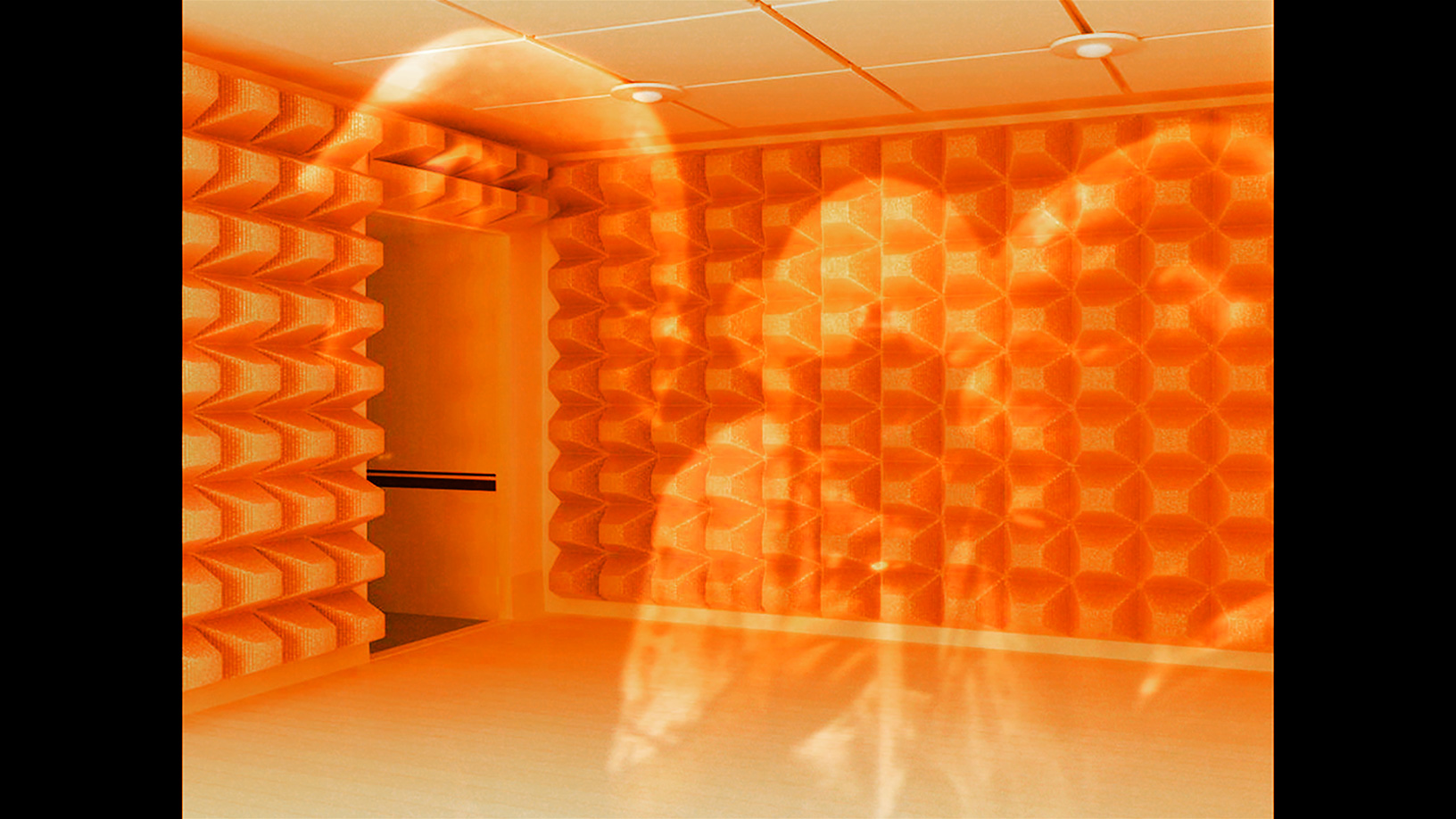
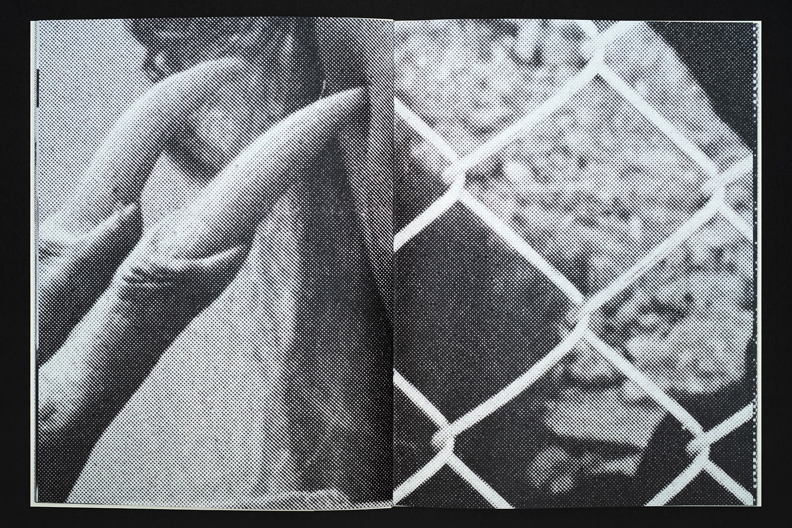
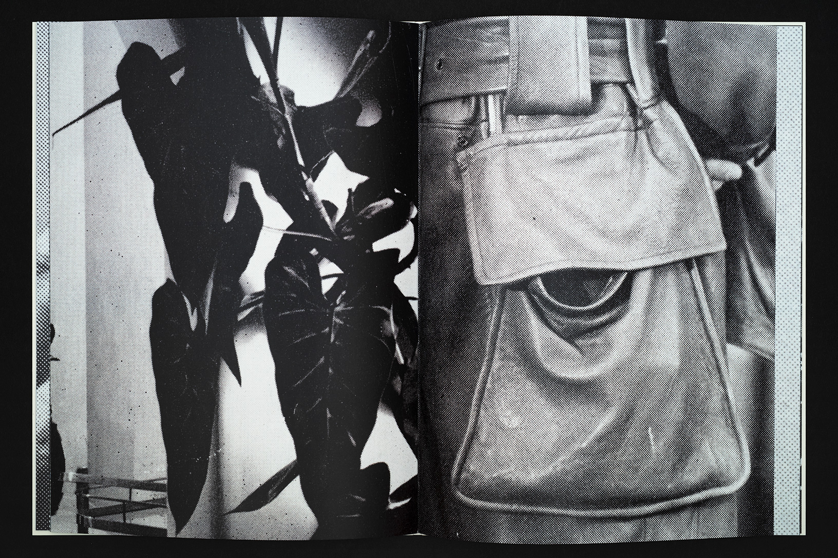
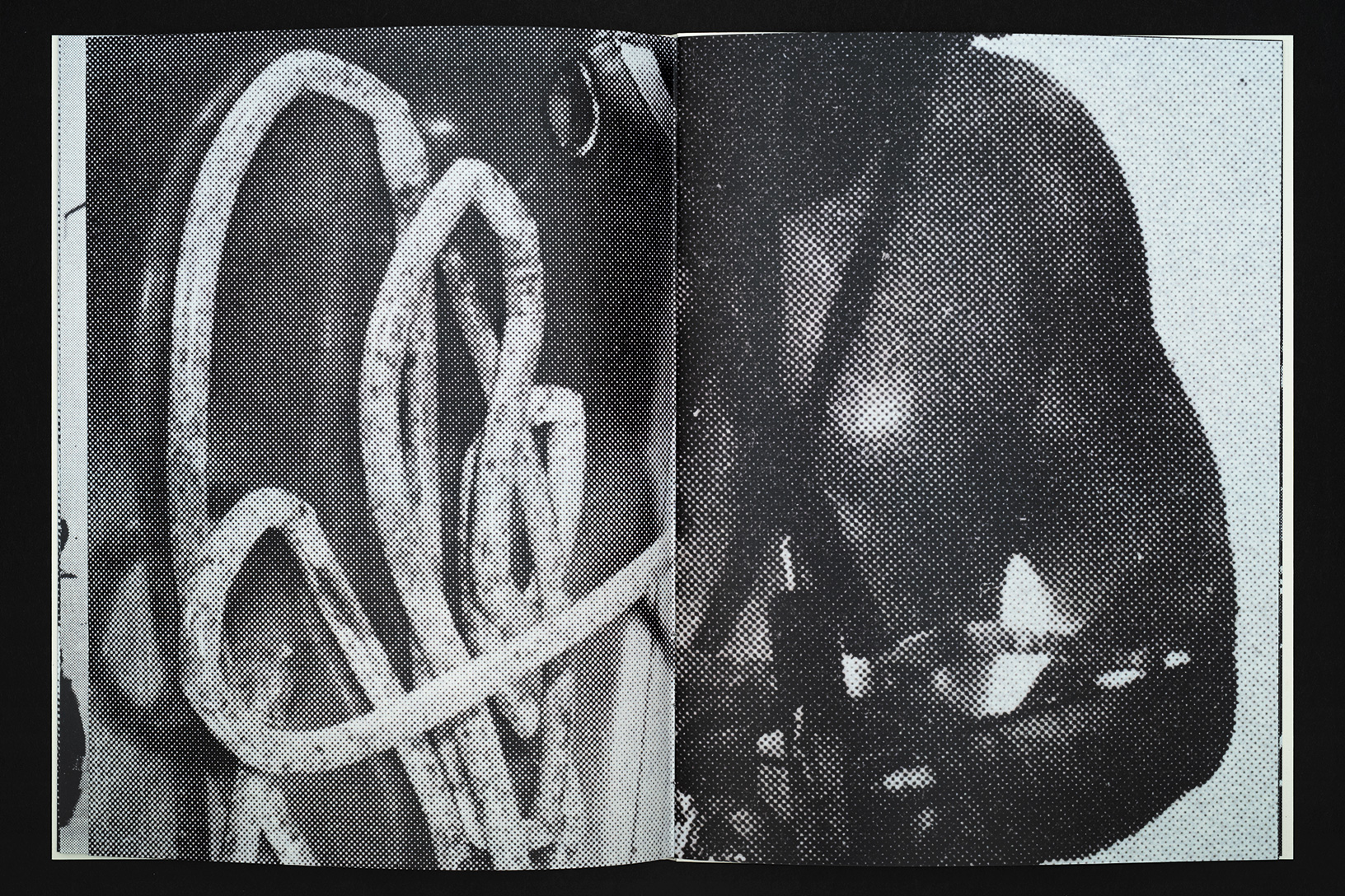
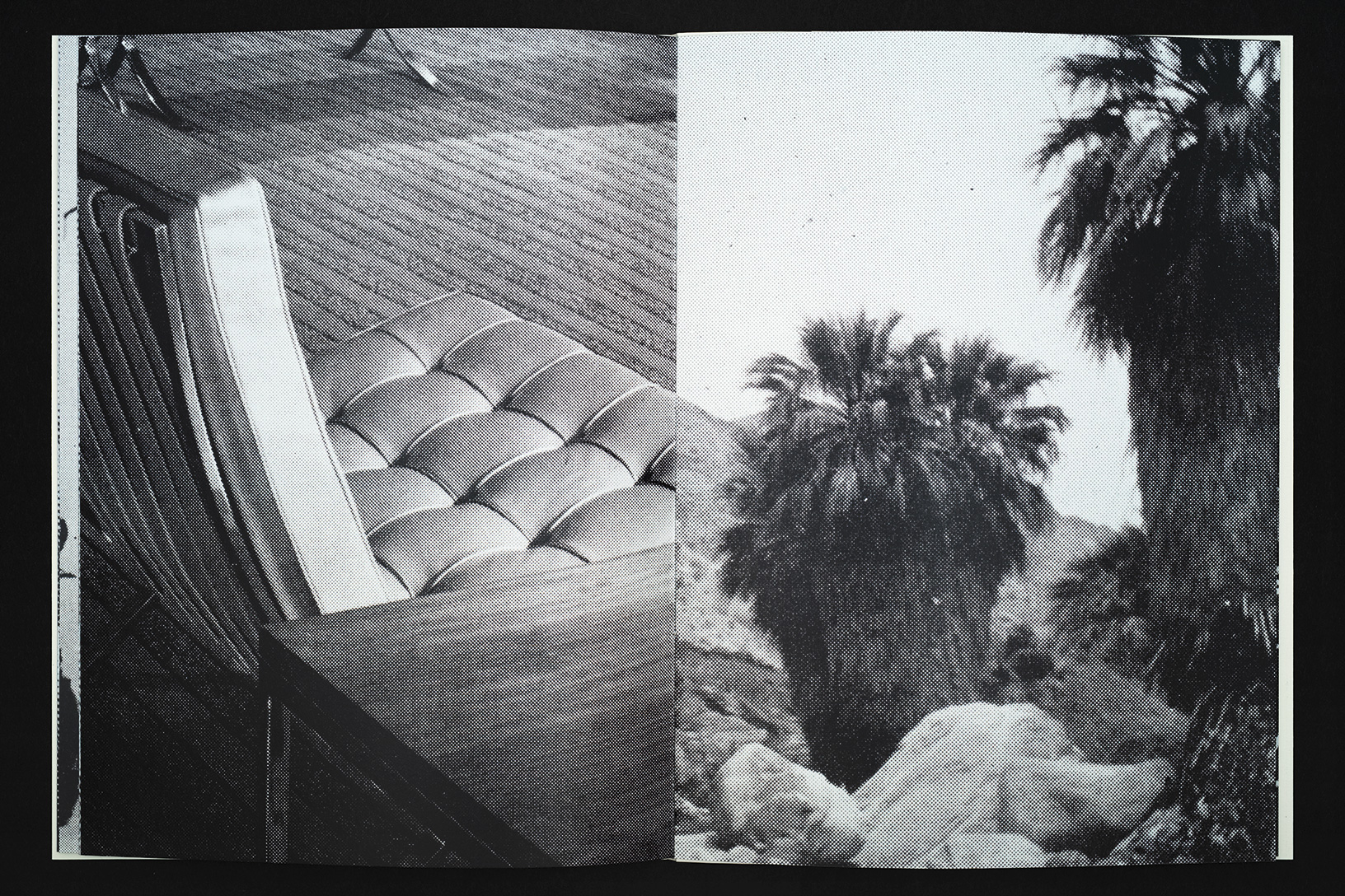
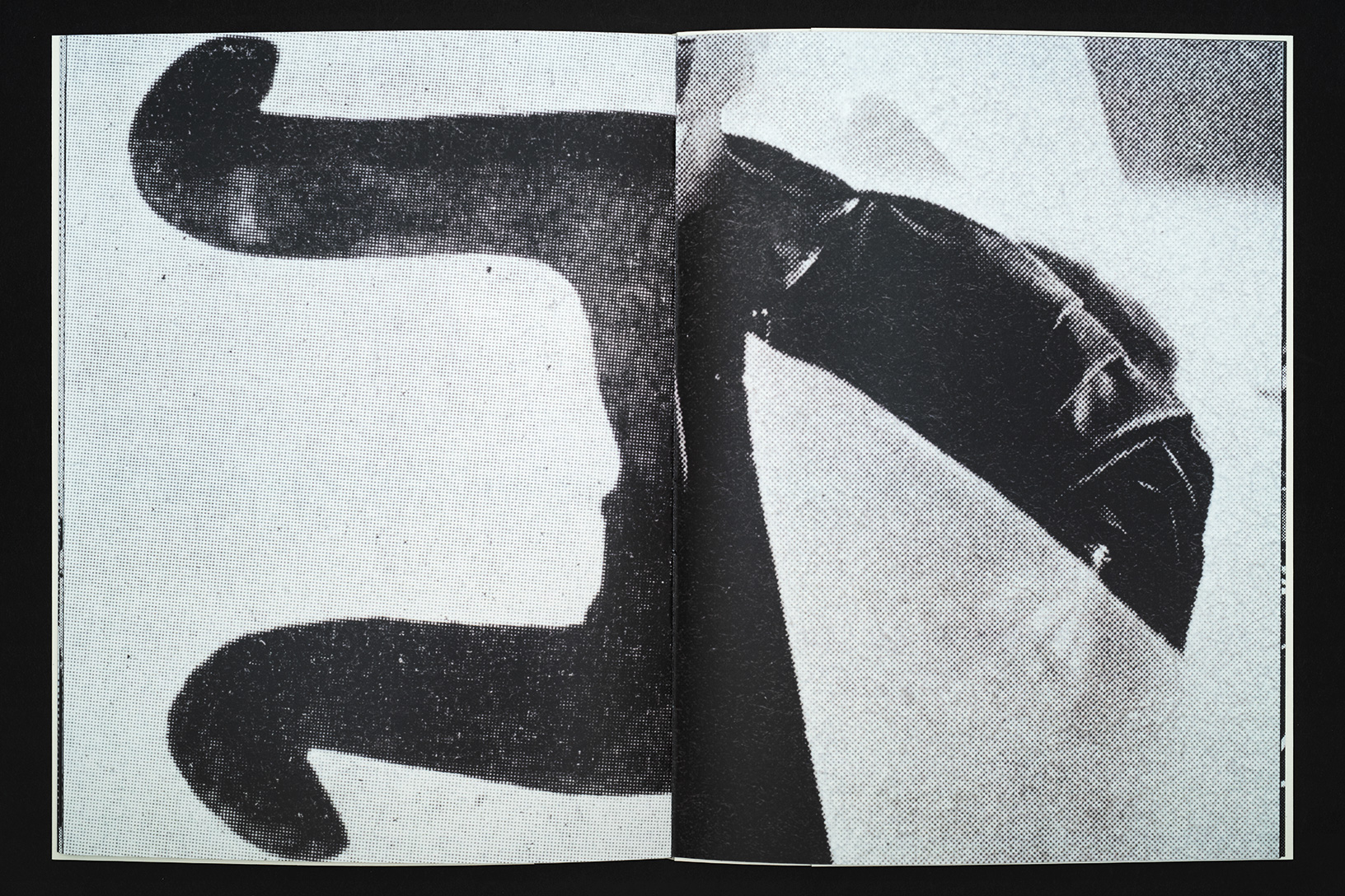
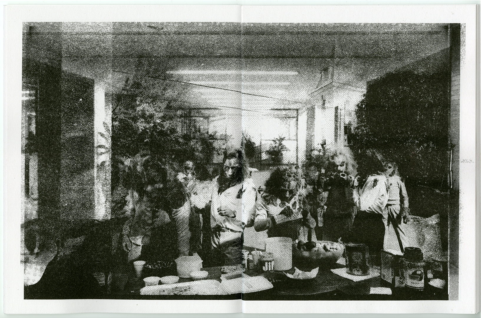
In George Kuchar’s video Seaside Show (2008) there is a small amount of footage from the opening reception at San Francisco’s 2nd floor projects for Kuchar – paintingsdrawingspaintingsdrawingspaintings 1970s to 1980s. This was a 2008 show of George and Mike Kuchar’s 2D work, rarely seen in a gallery setting.* I was at this opening, and when I watched this scene in 2020 it was like time kind of collapsed. I kept expecting to see my old self looking out at my current self. It’s just footage of a lot of people I know looking a bit younger doing all the things that we did—up until recently. The faces, the clothes, the room, everything looked pretty much the same as it would today. It was all so familiar. The documentary aspect of George Kuchar’s work is rarely mentioned, but his camera recorded so much—images of San Francisco, New York, lost artworks, artists, students, gallery openings, film festivals and screenings. His generous voiceover is like the anti-Werner Herzog—warm, enthusiastic, seemingly delighted to commune with others, and excited by food and bodily functions.

The San Francisco Art Institute, which (prematurely) announced its closure in March of this year, was also a big part of the Kuchar universe. George moved to San Francisco from New York in 1971 because of a teaching opportunity at the school. He became a huge presence there, and his weekly Psychotronic Film course in Studio 8 went on to influence so many. I always saw him around when I was an undergraduate student at the school in the late 90s and early 2000s. I began teaching there in 2006, and I clearly remember George bursting into one of my grad seminars in a panic because he had locked himself out of the faculty office and couldn’t get to his bicycle. When I watched Seaside Show it reminded me of both my years as an undergrad, and the time when I had just started teaching.

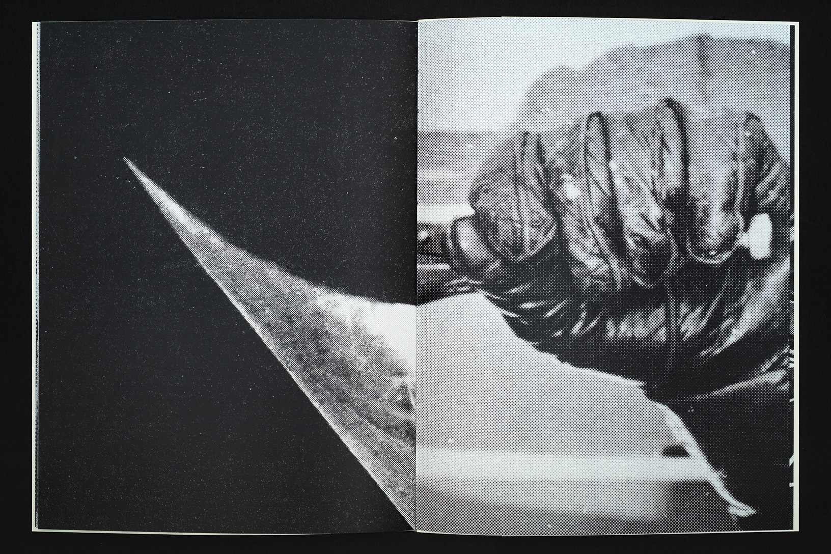
Seaside Show presents George and SFAI as many will remember them, and Kingdom By The Sea (2002) and Faulty Fathoms (2006) are like links in the same nautically titled chain. The prop room in Studio 8 shows up again and again with new props but also the same props. It’s like time is just oscillating, never quite moving forward or backwards. George looks almost the same, the SFAI tower appears again and again, the San Francisco Bay relentlessly laps up against the sea wall. Different students and different scenarios, but George’s voice remains constant. There are versions of George and SFAI that have disappeared, but other versions live on through the images in these videos and the memories they evoke.

—Matt Borruso, 2020

* In 2016 Gordon Faylor and I interviewed Mike Kuchar, discussing his drawings and the Kuchars’ connection with underground comics and graphic design. You can find that interview HERE.


YALE UNION
800 SE 10th Ave
Portland, OR 97214

Printed Publics: Contemporary Art and Design Publishing in the Bay Area

Printed Publics: Contemporary Art and Design Publishing in the Bay Area
December 7, 2019–August 31, 2020
Floor 2, Koret Education Center
Organized by David Senior, Head of Library & Archives

sfmoma printed publics
sfmoma open space printed publics

Printed Publics, installation view, 2020

SFMOMA’s long history of connecting Bay Area artists and art-publishing presses continues with Printed Publics, the museum library’s look at printed matter being produced by local artists and designers of today. These publications play with the structural elements of the book, the page, and new and old printing tools to create new work. Central to the idea of publication—literally embedded in the word—is a “public,” and Printed Publics examines publishing as a means of community building, information sharing, and collaboration.

Many of the works presented here can be handled and flipped through, offering visitors the unique opportunity to interact with artworks in an intimate and personal way. Through these books and magazines, independent publishers necessarily develop creative, informal methods for small-scale distribution of their projects, offering new spaces for conversations about their practices. Printed Publics also highlights the SFMOMA Library’s continued engagement with local publishers in building the collection at the museum.

Participating publishers:
Sming Sming Books, LAND & SEA, Eggy Press, Jessalyn Aaland/Current Editions, Visible Publications, Mitsu Okubo, RITE Editions, no place press, Colpa Press, NIAD Art Center, RE/Search Publications, Floss Editions, The Black Aesthetic, Tiny Splendor, [2nd floor projects], Publication Studio SF, Most Ancient, Stripe SF, David Wilson, TBW Books, Wolfman Books, Night Diver Press, illetante collective & Barbara Stauffaucher Solomon.


You Live

You Live

Sunsets, sunrises, eclipses, meteorites, early humans, artificial humans, constructed identities, masks, film sets, props, underground, outer space, green screens, the holodeck, simulations, replication, scans, grids, logos, screen shots, downloads, the void, places I have been, places I have lived, people we admire, people who have betrayed us, people who have died, spiral staircases, forking paths, the multiverse, the repetition of days, things that could have been, snakes, and snakes eating other snakes.

A life built out of images. Dissolving, one into another. At the midpoint between two images a third image appears. Connections are made and years pass. The sequence continues moving towards the horizon which recedes into the distance. 

These contextual images without a subject become the subject. The images are the territory. Data becomes substance. Films reveal themselves as films during their final scenes. Meanwhile, you live. 

September 6th – October 19th, 2019
Et al., San Francisco


Essential Forms: on the work of David King

From the book David King Stencils: Past, Present, and Crass!
published by Gingko Press, 2019

Essential Forms

There is a consistent aesthetic found in everything that Dave King does. It can be seen here in
this book, running through every page. His work distills the world into a series of essential
forms: silhouettes, monochromatic objects, frame grabs from films, photographs of shadows,
repurposed logos. Inspiration taken from art, advertising and comic books is boiled down into
only what is necessary. While there is always humor, there is nothing baroque. It is a world
reduced to the least amount of information needed to describe itself.

I met King in San Francisco in the early 1980s when he was part of the band Sleeping Dogs.
Back then I was very interested in his artwork, especially the Sleeping Dogs posters that had
appropriated images of Mickey Mouse and the Batman logo. In San Francisco at that time the
typical punk flyer utilized a rough shredded and torn graphic approach. The Sleeping Dogs
flyers were so different—they felt cartoony, clean and tight. Later I realized that he had designed
the Crass symbol, which was becoming more and more conspicuous in the Bay Area, tattooed
on bodies, and stenciled on walls and studded leather jackets.

In a way the Crass symbol, for which King is best known, is an outlier amongst the rest of his
work. He is typically focused on a singular easily readable form, but the Crass symbol integrates
multiple loaded images—cross, serpent, circle-backslash—into its final design. And its
subversive quality stems from this juxtaposition of well-known images that morph into something
wholly new. It is both enigmatic and familiar.

The stencil, in general and as seen here in this book, is a primal and effective tool. The positive
space of the stencil itself is cut away, but then magically reappears as paint is blown through it
onto the intended surface. Think of prehistoric cave paintings of hands, achieved simply by
holding the positive hand on the cave wall, filling a mouth with pigment and spitting onto the
“stencil.” The result is the image of the hand, but also an image of negative space.

The stenciled pieces presented here are a lot like the work that King has made in other
mediums—high contrast, graphic and readily visible from a distance. He is obsessed with the
shapes and outlines of certain forms, and their contours and volumes repeat themselves again
and again throughout his investigations. In this book we can see both process and result, a
working and reworking of the same forms to create subtle repetitions and variations on a theme.

King attended art school in South East Essex outside London in the 1960s. He later went on to
work in advertising in London, first as an art director and designer and then as an illustrator from
1967 to 1977. His work always reflects this professional graphic design history, and the specter of
advertising is apparent in everything he has done since. In fact, according to King, the design
of the snake’s head found in the Crass symbol reflects a promotional design piece he had done
for a client, Yorkshire Television, for a series of TV plays called The Seven Deadly Sins. In this
piece the snakes grew more twisted with every sin.

Like many British artists of his generation, King has an obsession with a certain type of
American visual culture—much of it relating to the postwar period. There are many examples of
this impulse in others: J. G. Ballard, Eduardo Paolozzi and Richard Hamilton of the Independent
Group, to name a few. At the same time there is something undeniably British about King’s
aesthetic. After living in America for the last 40 years, it’s as if he sees British visual culture the
way that he once viewed American visual culture. Whereas once it was Mickey Mouse, now it’s
the teapot creeping into the Crass symbol…

In the late 1970s King dropped out of the London advertising world and went to live with some
former art school friends in a communal living experiment in the countryside. This project would
take the shape of what we now know as Crass. It is not a stretch to compare King’s journey
from advertising to punk, to that of the fictional character Don Draper from Mad Men—exiting
Madison Avenue for the West Coast and Big Sur’s Esalen Institute. As utopian dreams fade and
new nightmares emerge, symbols and images of earlier promise remain as potent reminders.
The Crass symbol is one of these. It combines powerful elements into a simple form meant to
express something expansive. It is the distillation of a feeling—the promise of freedom, and the
rejection of a system that never cared about you anyway.

Matt Borruso, 2019

Hands and Feet and Their Supports

Hands and Feet and Their Supports

Some fully formed, others in a state of becoming, hands and feet and their supports. Cast and recast,
copied and recopied, rubber gloves, ur-feet, the feet of apes. Fragments that represent a whole, these
outermost extremities can stand in for humans. The hands and feet of ancient ancestors, present
selves, future monuments. Cast in concrete, some are simultaneously both hands and feet. Others
are just hands on paper, like cartoons or cave paintings.  Cheap materials that are all around us.
Materials used to construct shelter and transmit information.

The supports extend us. Stands on stands. Feet on tables, feet on shelves, glued up prints.  A support
can be ideological, structural, architectural. Technology can be a support. A support can be a big idea
meant to save the world. It can be a matrix used to display objects in an exhibition. And sometimes
the supports are simple extensions—clothes on skin, or shoes on feet.

Becoming what supports us, what constructs us. Becoming the prosthetic that extends us.

September 8th – October 27th, 2018
Cloaca Projects, San Francisco

press release
Art Practical 
Art in America


Domus, March 1964 and Black Rubber Hand, 24.5 X 18”, screen print on newsprint with wheat paste, 2018
Vase with Ozzy’s Left Hand, 24.5 X 18”, screen print on newsprint with wheat paste, 2018


Plant Stand and Pedagogical Support, 38 X 20 x 15”, concrete, felt, rubber, and powder coated steel, 2018
Interior Cast (Right) and Support, 135.5 X 13 X 7.5”, concrete, felt, and powder coated steel, 2018
Feet, Full Pair, 12.5 X 9 X 6.5 each, concrete, beeswax, and felt on powder coated steel and glass support, 36 X 20 1/8 x 18 5/8”,  2018
Interior Cast (Left) and Support, 142 X 13 X 7.5”, concrete, felt, and powder coated steel, 2018